Pages

Friday, 29 June 2012

Design Team Call!

It’s that time again – The Studio needs YOU! We’re searching for the new Studio design team!

We are a chilled out, drama-free team and are looking for some new designers to join our family.


What is required from our DT members:

1. Maintain a regular presence on our blog and our private DT area.
2. Leave genuine feedback on followers' blogs and encourage those who enter our challenges
3. Create 2 scrapbook pages per month for our regular Sunday challenges. We may also ask you to create an occasional extra project for special events
4. Set occasional challenges and other ad-hoc requirements, such as scheduling blog posts.

Our site does not run for profit, just fun, so there is no payment (money or stash!) for your work. Products may be supplied to the DT on occasion by sponsors. Of course, you also have another string to add to your scrapbooking resume!

So, to apply, please email amanda@scrapbook-101.com with DT call in the subject field, and include the following:

1. THREE projects which showcase your best work (image files no bigger than 1MB please – failure to follow this guideline may result in your email being rejected by our mail server)
2. A paragraph about who you are, why you’re PASSIONATE about paper and glue, and what you could bring to our team.
3. A link to your blog and any online galleries you have, Facebook, twitter – anywhere you share your work.
4. A list of any current or past design teams you have belonged to. Previous experience is not required – we love to see NEW talent! Your passion and enthusiasm are what’s important!

Our DT call is open to everyone; past DT members are also welcome to re-apply. International applicants are welcomed and encouraged to apply. If you have any questions regarding the call please email me at amanda@scrapbook-101.com

The call is open now, and will close on 15th July 2012. Those selected will be notified shortly after that date.

The term for successful applicants will run from 1st August 2012 – 31st January 2013.

Good luck to all who apply, I can’t wait to see your applications!

Sunday, 17 June 2012

17th June - Negatives (with Jenni Bowlin DT)

Everyone up for another challenge?!
Today is all about Negatives, interpret this however you like! You could use actual photo negatives, negative space, or even negative pieces from your stickers, punches or die-cuts.

We are joined again by the lovely Jenni Bowlin Design team as well as our DT so we have loads of great inspiration for you!

Anna
This is a great challenge to use up those scraps that you have used for punches, I used lots! I also created a negative rectangle (by the title) with my misting.


Daphne

Those "All-over-the-Page"-Punches are perfect for this week's challenge! I used a Pinking Circle Punch by Martha Stewart to create the fourteen windows in my background paper and then glued paper behind the holes. Perfect for every kind of scraps you can find in your basket and waiting to be used!
I also cut out bigger circles to stick around the background paper, sewed some transparencies and filled them with different kind of confetti and some of the circles even have hand stitched parts around them!
To finish it off just a little bit of bling and you're done!


Jan
Instead of taking the border punch all the way across the bottom of this card, I left a little on the ends so I could use the negative space along with the punched border. 
I layered the butterflies, with the fuzzy bottom paper adhered flat and the top layer lifted a bit.


Jules

I used two lots of punch waste, from the large and small circles, and the edge of a label sticker to frame my title

Katherine
It's great to have some of the Jenni Bowlin girls joining in with the challenges this month, so it was the perfect excuse to use some beautiful JB papers.  The picture I chose is from a lithograph of my Mum, I just scanned it in and had it printed and it came out really nicely.  For the negative element of the challenge I die cut some butterflies from a tag and then added stitched swirls and lots of distress ink and paint to keep it all vintagey.

Valerie
As soon as I hear 'negative space' I can't help think of die cuts - whether from a manual or digital machine - I save a good portion of my negative cuts because I love their potential. For this challenge, I used a digital cutter (a Silhouette) to cut my title, which also serves as a frame for my photo. I backed it with a simple grid pattern so it wouldn't overwhelm the page.


Here are the LOs for this challenge from the JBS team :) They have done an amazing job again with this challenge!
Briana Johnson used the negative space within several thin frames to create structure on her page.
Corrie Jones made a festive layout with punched stars, their negative spaces, and even a vintage slide negative.
 Dina Wakley hand cut some hearts from a piece of patterned paper for one layout and then used the negative space as a design element on this layout.

A mini-album from Jill Sprott in which the pages are a mix of patterned paper, overlays, and the negative spaces left behind from the stars that she had used on another layout.


Louise Nelson punched three little stars from red cardstock and then backed the negative space with kraft cardstock to make a sweet embellishment.


 A graduation gift card from Ranjini Malhotra  with circles punched out of the Wren paper then backed with other pieces from the June JBS Mercantile Kit and the top layer popped off with foam dots for dimension.


Waleska Neris used her Silhouette to create this overlapping circle design and then backed some of the negative spaces with a variety of patterned papers.
The lovely ladies over at Jenni Bowlin also have kindly given another $25 gift certilicate for the JBS store for this challenge as well!
JBS Mercantile
Thanks so much to the Jenni Bowlin ladies, for you generous prizes and your fab layouts, we have loved having you join in with the DT this month!

Please link up your entries in the side bar to be in for a chance of winning, we would love to see what you create! Remember if you enter both challenges you will be in for a double chance of winning this month!
Happy Scrapping!

Thursday, 14 June 2012

April Winner!


Wow, where did all the time go?! Sorry we're so late with the April winner! There were some great entries, thanks to everyone that joined in - I hope you enjoyed the challenges as much as we did.

Without further ado, the winner is...

...Juliwan! Who entered this lovely layout:
Congratulations Juliwan! Drop me an email with your details (scrappingmojodesigns@gmail.com) and I'll get your prize to you :D

Sunday, 3 June 2012

3rd June -Vintage (With special guests from Jenni Bowlin's team!)

We have some fabulous pages from the DT to share this week, along with some additional inspiration from Jenni Bowlin's design team who are joining us for the month of June!

It's going to be a fun month and we have a very generous prize - a $25 gift certificate for the JBS store :) Oh, but that's not all... that GC is for THIS challenge only - we have another one to give away for our second challenge on 17th! You'll definitely want to link your projects up this month!

So to welcome our guests, today's challenge is all about vintage!

Vintage photos, vintage ephemera or just a vintage colour scheme... use your creativity to add a little vintage flair to your project!

Here's what our DT came up with to inspire you...

Amanda


I use a lot of Vintage ephemera in my layouts on a regular basis, so I decided to make a vintage page without vintage supplies this time around. Instead I used the 'Vintedge' paper line from Ruby Rock-it and a vintage photo of my Great Gran. I thought the British themed collection was appropriate too, seeing as it's Jubilee weekend ;)

Anna
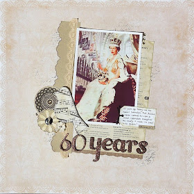
I went for a vintage feel to my layout. I used the Old Type embellishment kit from The Make and Create shop. Photo of the Queen taken from Google images.

Daphne

For this challenge I went for a vintage colour scheme! It works pretty well with my baby photos - I think they are the first ones of me! I cut out some of the roses on the PP, layered them and used some glitter glue and Glossy Accents.


Katherine

I love to use vintage goodies on my pages, so along with an old photo of me there is a dictionary page, an OA flash card, and 2 vintage buttons from my Grandma's collection.

Jan

I went with a vintage photo of my Dad, circa 1942, and used some vintage looking Graphic 45 papers. 

Jules


I used some vintage style papers from a couple of old GCD Studios collections, and a script rub on from Kaisercraft for my title. I don't have any vintage photos, so I cheated, and ran a vintage action on this photo of Mojo in Photoshop.

Valerie
I have always been a fan of vintage style - in all it's forms: antique ephemera and current day versions, as well. For my page I used some vintage style die cuts to frame my photo and supported the design with some summery, vintage-feel patterned circles and ruler strips:

And here are the amazing creations from our guests...

"Son" - Briana Johnson used a collage of vintage ephemera to highlight the arch her son is walking under.


"Golden" - Jill Sprott used the words on a vintage label to set the stage with the theme of her layout.


"Life" - Lisa Dickinson layered bits of ephemera and a vintage slide in her grid to add depth to the design.
"Sweet" - Betsy Sammarco used a vintage Dennison Label for her journaling. She also used reproduction vintage ads and newsprint to give a timeless quality to her work. 


"Horse Crazy" - Doris Sander used a vintage letterhead and manilla envelope as the base of her design on this layout. She also scattered extra bits of vintage throughout her page.


 "Wipeout" - (also from Doris) The background of this layout is entirely layered from vintage
receipts, checks, and prescription papers.


All of the layouts from the JBS team, except Wipe-out, were made from the JBS Mercantile June Papercrafting Kit which, as you can see, is heavy on the vintage and vintage inspired product this month.  We also sell a vintage add-on kit each month called, Artisan, but the June one that our designers used for these layouts is already sold out.  We still have several vintage ephemera pieces available in the JBS Mercantile Flea Market, however.  You'll see lots of pieces there that were used on the last layout, "Wipe-out."


We look forward to seeing what you create! Remember to link up your entries by the end of the month to be in to win prizes. We'd also love it if you'd stop by the blogs of our guests to say THANK YOU!