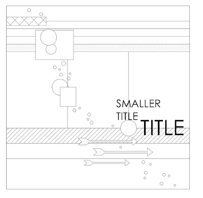
Valerie has created another lovely sketch for us this month it was inspired by Daphne's no patterned paper layout from a few of weeks ago.

Anna


Chantelle
Daphne
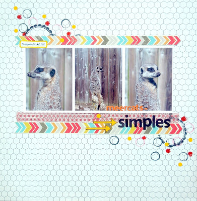
Do you remember my layout with the Washi-Tapes?! It was just four weeks ago when I did the No-PP-Challenge - and today?! Val did a sketch out of my layout and re-scrapping it is not that easy as I thought! But I managed it last minute!
I used the new paper collection by American Crafts Dear Lizzy "Lucky Charm" - the colours fit perfectly with my shopping experience ;)Youngest kid learning the kitty to skate board.
Details:
Kat
Katherine
A super sketch which took me out of my comfort zone, as I don't usually fill pages up anymore :)! I did some embossing and stitching, replaced the circles with hexagons to match with the papers, and then a few sequins amongst them. I had a go at stitching some arrows in embroidery thread which I really enjoyed.
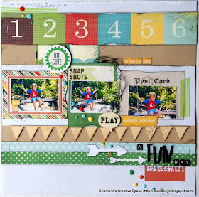
This months sketch was so inspiring and easy to work with. I used a photo of my son showing his "baby monkey face".
Teresa Collins Memories collection, Silhouette, Adornit mini alphas and Kraft CS
Tessa
I love my white space, so I shrunk down the sketch and essentially placed it in the center of my page, giving me white space around the edges. I stayed true to the diagonal line of embellishments, as well as the arrows.
Guest designer - Nikki Birch
The journalling reads "Just days from being 2 years old you really are not saying as much as I thought you would at this age...but you are making all the right noises. You like to play with cars, trucks and trains. You like to do the sound effects, Brrrmm!!"
I made the inked lines by pressing a distress inkpad onto a craft sheet and spritzing with water, I then used an acrylic sheet approx 5mm in depth and pressed it into the ink and then onto my card stick, I did this with a few different colours, allowing the inks to bleed into each other before drying off with a heat gun.
What a great job everyone did, to get so many different layouts out of one sketch! What would you do with it? We would love to see so please link up your creations to the side bar!
What a great job everyone did, to get so many different layouts out of one sketch! What would you do with it? We would love to see so please link up your creations to the side bar!


The variety from that sketch is just amazing. Lovely work.
ReplyDeletelove this layout and I think all the examples are fab.
ReplyDeleteYou should visit my blog for a chance to win some blog candy
on http://dawnthecrafter.blogspot.co.uk/
What a fabulous new find!! Fantastic sketch and such wonderful inspiration :0)
ReplyDelete