Pages

Sunday, 29 June 2014

May's winner and favourite

Hey, everyone!  Thanks so much for playing along with all our challenges.  You all make it so difficult to pick a winner.  Here are the results from May:
First up is this gorgeous layout from Jessie Grey.  We love her take on the sketch challenge and really adore the colors she chose to work with:

And our winner for the month of May is Kerry Bruce.  We really loved her fabulous take on our sketch and all those amazing summer details!

Congrats ladies! Kerry, please email Anna at thestudiochallenges gmail.com to arrange to become our guest designer for a month.

Watch out for a DT call coming up this week!

Sunday, 22 June 2014

22nd June - Triangles

Todays challenge is all about one little shape with three sides, yes if you havent guessed already its Triangles! What creative ways can you come up with to use triangles in your layouts?

Here's what the design team came up with:


Cari
I really like triangles and I use them a lot, so this time I tried something different and used only triangle stamps. I'm not very mixed media and I feel this page look like a lot of mixed media and I love it!


I love this tiny butterfly which also has tiny triangles inside.


Hilde

I have a crush on creating with busy background papers ATM and by using large triangels as mats, the layout looks less busy.


 Using repetitive patters always work when it comes to pagedesigns, so I have triangels other places too to get the more uniform look: inked with a stencil and some larger pink paper ones.


The journaling tells about our cat mercedes who was completly gone for ten days earlier this summer. We finally found her trapped in our neighbours greenery...


Jinny
Triangles are my second favorite geometric shape to scrap with, next to circles.  I've managed to tie both into my page, which was inspired by a single sheet of patterned paper from Crate Paper's Open Road Collection.


Kat
Is it weird that I am terrified by a shape?  I didn't even realize my fear of triangles until I tried to scrap with them...and I found it to be quite a difficult challenge!!

Katarina
Triangles is a huge pain in my creative process... I really struggle to use them.... and I rarely get them to fit in.. not even when I have the intention to add them.
This time I managed to incorporate triangles as banners... and it actually worked well. Its one of few times I actually has been satisfied with the triangles in my work.
I have 3 kids and one is looking just like I did when I was a child. He is a MiniMe.


I used the triangles to frame the photo but also to create balance in the page.
I used FabScraps new collection The Gentlemen's Club on this page as I thought the colors matched the jungle in which this picture was taken.  


Didn't they do a great job! We look forward to seeing what you create, please link them up to the side bar for a chance of becoming our guest designer. 
You have until 6th July to enter this months challenges.
Also watch out for a design team call it will be here soon!

Sunday, 8 June 2014

8th June - Project life

Something a bit different for you today!

Today challenge is Project life style - create a layout inspired by Project life but without using the pockets!


Anna
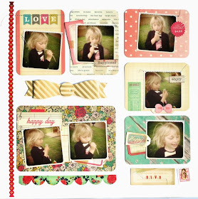
I haven't ever done anything Project life before but I quite like it so this was good to try it out for a bit. It just so happened I got some PL cards for  normal scrapping recently which were perfect for this, I didn't stretch to a whole page though, I had to have a bit of 'white space'!

Cari

I really like project life! I started my first PL album this year (even though I haven't taken many photos of it yet) so make this page was super easy. It was just as making a new week. I used some photos of my nieces and, as in my PL, most of the writing is in Spanish.


Hilde

I don't take photos on regular bases (like every day), so "Project Life (PL)" has never been my cup of tea. I also enjoy the process of designing single pages, so that's a second reason for not jumping on the pocket scrapping train. But I admit the design/style was perfect when I wanted to use multiple photos on one page, like on this one, and I know I will do it again!
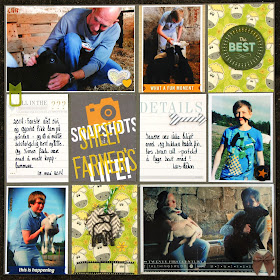
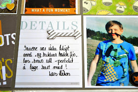
Title: Snapshots of a Sheep Farmers Life
These photos were takn when we payed a visit to friends who have had their first lambs ever.
I'll admit that I'm not a fan of Project Life.  The thought of documenting so many photos overwhelms me.  Plus, I think the grid design gets a little dry from page to page to page, but it's not very often that I use such for my own layouts.  So, despite my hesitation and after a little jumpstart from our fearless leader Anna, as well as inspiration from a couple of challenge sites, I'm pleased with what transpired.


Kat
I love Project Life, but I've rarely translated the concept into a layout.  For this one, I decided to scrap a bunch of photos from a recent vacation my husband and I took to Hawaii.  We went to Pearl Harbor one day and visited the USS Arizona Memorial and took a tour of the USS Missouri.  I had a lot of pics from the day and wasn't sure what to do with all of them.  I figured this challenge was perfect for finally getting them on a page!


I like project life cards, and I often incorporate them in my LOs as journaling cards, but when I made this LO, I wanted to use the display of the pouches as the base of my LO. So I used the same way of showing off my cards and photos as if I had used a PL album. And it turned out quite clean and simple, but I love it!
I used PL cards from becky Higgins and Studio Calico. 
I decided to use Project Life kit cards for my project and just add a series of Photos that I love. This is the result:

 I used Becky Higgins PL kit Flea market by Maggie Holmes and correlating decorations.


The design team did a great job, how will you get on? Please link up your layouts to the side bar so we can find out!
Happy Scrapping!