Pages

Sunday, 21 December 2014

21st December - Christmas, Non traditional Colours

As its so close to Christmas we want you to create Christmas layouts, easy right?! But there is a little twist, we want you to use non traditional colours for your layouts! Which colours will you pick?

Hilde
Christmas is off - Mercedes killed Santa.


Such a sad story needed depressive colors *lol*
Ouch - I just discovered a typo in the title - and I don't have time to make it up! Can you find it?

Hee Sun Kim : Colorful dream....Beautifully decorate my house, It has been a joy came to me.

Jinny
I borrowed ScrapMuch?'s December Colour Palette for my page, which definitely steers away from the traditional red and green Christmas colors.  I have also highlighted non-traditional Christmas pics.  I won't bore you with the story, as I've already done so in the journaling and on my blog, but I will tell you that I had lots of fun with circular elements and stamping and am so happy to have captured this moment for my albums.

Kat
I got my inspiration from the current issue of HGTV magazine:

The black, white, turquoise and red looked so pretty to me, so I just had to use it on my Christmas layout.  I added in pops of silver, too! :)


Sindi:
I have a terrible time with traditional Christmas colors, so I was happy about this challenge.  I printed the photo in black and white so that the red and green in my son's outfit wouldn't show.  I decided to go with yellow, gray and a bit of blue in my background and I think it worked quite well.


Tessa
 I love to add black to my Christmas color palettes, and instead of green I went with a minty aqua blue.

You have until 4th January 2015 to get your layouts in so if your quick you could even create a layout about this Christmas coming!

We would like to wish you all a very Happy Christmas and a happy new year, have a wonderful time!

Thanks to everyone who has entered this year, we have had so many great entries! We hope you see you all come back next year too!

Wednesday, 17 December 2014

October Winner and Favourites

Sorry I am so late in posting winners and favourites, don't know where the time goes! We had many lovely entries in October it was so hard to pick!

The winner is ....
Amy with this lovely mixed media layout.


And our favourite entries are.... 


Thanks to everyone for joining in, we had a great time looking at your entries!

See you on Sunday for the last challenge of the year!

Sunday, 7 December 2014

7th Dec - Childhood Memories

The Challenge today is: Childhood Memories, now is the time to go digging and find a lovely childhood photo with a story behind it. You could even recreate the photo, then and now!

HeeSun Kim:
I was very hurt from when I was born. The doctor said I would die before 5 years of age. I was hospitalized for five years. Therefore, I don't have a picture of my childhood. My parents stayed at my side from morning until night, always came to the hospital. Grandma bought my older brother up. I can't remember, This day was warm & nice, I went to a picnic with my older brother.


Hilde:
My mum, and later I, put our photos in albums and wrote some notes/the story behind the photos along with the photos. This is why I know this photo of my brother, my dad and I, was taken in 1976 on a canoe trip close to the Swedish border. The snap shoot photos are often of poor quality, but still good enough to tell about the 1976 camping fashion :-)


Jinny:
I have only a small handful of childhood photos of myself at my disposal, and believe it or not, they've already found their way into an album.  So, I thought it might be fun to tell a story from my childhood on a page with pics of my own cuties.  It's all about a childhood tradition that I'm thrilled to share with my own kiddos today.  I've had that Echo Park bokeh paper for months.  Every time I picked it up I saw Christmas and am so excited to finally have gotten to use it.

Kat:
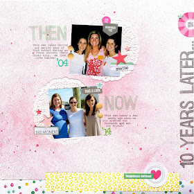
For this challenge, I found a photo of myself and my 2 best friends from high school.  We still remain close to this day.  So I scrapped the photo of us from 10 years ago and then a photo of us from this past October.  This challenge was so much fun - mainly because I got to dig through a whole bunch of old, great photos!!

Sindi:
I ran across this photo of myself at around age 6 or so. I think I remember that I fell asleep this night waiting for Christmas to finally arrive. I always was an impatient one! :) 


Tessa:
I recently found this photo of myself at about 3 or 4 years old. I don't know anything about the story behind this particular photo, but I thought it was a good representation of a collection of early memories - twirling in pretty dresses. I remember several different dresses I had - some with matching purses - and I think this childhood love of cute dresses is the reason I love vintage dresses for my baby girl today.

Please link up your childhood memories layouts to the side up, we would love to see them!

Sunday, 23 November 2014

23rd November - Daily Routine

Hey, everyone!  What does your normal day look like?  Today's challenge is all about scrapping your daily routine.  Your daily routine may not seem exciting or scrap-worthy, but we have a feeling that you'll appreciate the fact that you scrapped the "little moments" in a few years...

Here is our design team's take on the challenge:

HeeSun Kim
I use a curling iron every morning. Brown curls tumbled down over my shoulders.
So beautiful! I love my hair style ♡


Hilde

My morning routine: get out of bed, put the kettle on, take the dog out while I walk to pick up the news paper. News on digital medias is not the same as a real piece of paper!


Jinny
Many of you already know that I'm a homeschool mom, so the biggest part of my daily routine is helping my kiddos through their studies.  Yes, it's challenging; but the rewards are endless, and we wouldn't have it any other way.  I couldn't help but dive into my October Jenni Bowlin kit one more time before opening my November box.  Most of the products used here come from just such with a few extras thrown in to finish things off.

Kat
For this challenge I focused on my normal weekend routine.  I work pretty long days, so I thought it would be more fun to focus on my weekends...

Sindi
I went at this challenge from a bit of a different angle. I decided to use a "everyday moment" kind of photo and use my journaling to talk about how much I love those normal, routine, every day kind of moments.


Tessa

Thursday, my favorite day of the week!

Guest Designer Erina
My husband and my son spend lot of time together!! One of their daily routine is the ipad!! They play together and having fun with some online games!So here is a modern layout with a touch of mix-media,at the time they play with the tablet!
I used lot of stamps at the background and some wood veneer!!! Thanks for the honour to be guest designer this month!!!

What's your daily routine? Please link up your entries by 7th December.

We now have a Facebook group for fans of The Studio to chat in, please come by and join in with the chat, we would love to see you there. 

Sunday, 9 November 2014

9th November - Sketch

Today it is time for another lovely sketch that Valerie as created for us. This time she took inspiration from Tessa's August Mood board layout. What a great sketch to get your inspiration going!


Anastasia

In the last couple of months I discovered the joy of cooking. Before that, cooking was stressing and something I avoided as much as I could. But now it's totally different, I love learning, experimenting... and enjoying the final result. So I decided to use the photo of the first dish that made me proud (yes, I am such a novice!)


Hilde

My FIL passed away in July. He didn't want a grave with a tomstone, so we applied the authorities for permission to spread his ashes into the sea, Permission was obtained and in late september we spread his ashes. We live at the seaside so every time we look at the window we are reminded of him


I had so much fun making this sketch my own with a happy combination of papers and embellishments and lots and lots and lots of die-cutting.

This sketch was too much fun.  I really love everyone's take on it.  I stuck pretty close to the sketch - just added in some layers and moved my corner accent to the other side.


A picture inspired by a trip we took to the south where we bought our first plants for our garden. Pure love, pure joy. I love this selfie, even more because my husband has it on his work desk.


I loved this sketch! The big square was a good anchor for the page. I chose to use strips of patterned paper to build the square. I folded and distressed the strips a bit for dimension. In the end, I was very happy with my layout. 


Tessa
Since my original layout was about my daughter, I decided to make this layout about my youngest son. I had a lot of fun reinterpreting my design with masculine papers and embellishments.


Hee Sun Kim
Earlier this year. I went on a travel to LA. Blue sky, cool breezes, brilliant sunshine...My fingers were embellished with shiny nail art. I was very excited this day.


Guest Designer- Erina
It was a fun sketch and I love it!! Instead of the small circles I made a bigger one with blue mist!! This is a clean and simple layout with my son George and I used some colourful embellishments!!My title is number ten... cause my son has 10 great reason to love summer... and his glasses are the 10th reason... He loves to wear them ...So this is my page:


The design team did a great job again with lots of ways of using the sketch, hope they have inspired you! You have until 7th December to link up your layouts to the side bar.
Happy Scrapping!

Sunday, 26 October 2014

26 October - Mixed Media

Today's challenge is a fun one....we want you to GET MESSY!  Create a mixed media inspired layout!

For those of you that may need a little help, here's the definition of Mixed media:
A technique involving the use of two or more artistic media, such as ink and pastel or painting and collage, that are combined in a single composition.

Here are the fabulous creations that the design team made:

I love playing around with mixed media and my paints, mists stamps and stencils so have a great time on the layout!

Hee Sun Kim
I'm getting on the old bicycle. AND...Now my journey has begun....


Hilde
Isn't this dude the cutest?
We were out for dinner, and when we came back to our stateroom on the cruise ship (yepp, cruising in September) he just was there :-)
Details/close up photos in my blog.

I pulled in lots of messy goodies for my take from mists and inks to acrylic paint and a bit of Color Shine, not to mention a heap of stuff from October Afternoon's new Apple Cider collection.  I was thoroughly inspired by all the wonderful goodies I received in this month's Jenni Bowlin Papercrafting Kit.  It simply oozes my favorite time of year.

Kat
I pulled out a bunch of messy stuff to make my background for this layout...

 I loved this challenge! Almost all my layouts have paint on them, so it was right up my alley. I took this photo of our yard a few weeks ago and it inspired me to use some fall colors.

Tessa
It was good for my crafty soul to stretch outside my comfort zone for this challenge! I used whipped spackle and a stencil, india ink and Heidi Swapp mists on watercolor paper to create my background.

Once again, the design team did an awesome job!  We hope that we've inspired you to get out your mixed media products and get messy with us.  Remember to link your projects up in the sidebar for a chance to win this month!

Sunday, 19 October 2014

September Winner and Favourites

Browsing through all the entries for September was so much fun – we just love how different everybody is solving the challenges.
Picking winners is always hard. Every creation has something special in it, and they often give us glimps of your everyday life – they are personal to each and every of you.

But it has to be done and here are the winner and runners ups:

Our winnner is......


We love Erina's take on the sketch and those great circles!

Runners up, in no particular order:
Yvonne

Kerry

Lesley
Congrats ladies!

Erina, please email us at thestudiochalleges@gmail.com so we can discuss the details about a GDT spot 

Sunday, 12 October 2014

12th October - Big Photo

Today we want you to create a layout that focuses on the photo. Please use a photo that is bigger than standard 4" x 6" size on your layout, how big can you go?!

Anastasia

For this layout the first decision was, of course, the photo. I thought "which is the first photo that comes to my mind that I really love but I haven't used in a layout yet?". And Lola's photo as a less two months old kitten came to my mind:


HeeSun Kim

A few days ago, I went to a park called "Sky Park". There is only filled with flame grass. I've got peace of mind there. And, I felt the love. I have print large photo of 12 x 12. I think it was a very good choice.


Hilde

These guys are my two sons during a session with two professional photographers at a cruise earlier this fall. When I picked this photo as one of my favs, the photographers though I was crazy - was this something to keep? I knew it would be perfect for telling the story about the session and I love how this layout came out.
I do apologize for the slighty angled image - I need to practise on taking good shots of my layouts :-)


Jinny
I hope that I didn't totally cheat this one.  While I'm more of a small photo scrapper, I really would've loved to do this one justice with a big photo; but with my busy schedule, I just didn't have time to sort through my thousands of photos to pick one that deserved the larger size and have it printed in time.  I did want to get this 5-3/4" x 8" birth announcement for my littlest into his book, though.  So, I went with it, using the palette from the announcement itself as inspiration and pulling in a few of my favorite patterns (i.e. gingham, polka dots, and bitty florals).


Kat
I had a really hard time with this challenge.  I will admit that large photos make me uncomfortable.  I've had this family photo laying around for a while.  I am not too happy with the end result - I guess that means I just need to keep practicing!  :-)

Leslie:

Long ago as a project had scrapear This photo is not wanted me to another job decorating my house, until finally win out and can translate a simple and details idea. A worn photograph with the time it deserves be collected and treasured.


Sindi
This was sooooo hard for me! I am accustomed to using smaller photos for some reason. I'm glad I stuck with it, though. I am tickled pink with the end result. This photo of my little boy deserved to be big anyway. :)  

Tessa
I loved this challenge! I had my photo printed as an 11x14, then I trimmed it down to 11x12 and filled the additional space with tags and die-cuts. Can you believe this started as an iPhone photo?


The design team did a great job again! So now its your turn, what an you do with a big photo? You have until 9th November to enter.
Happy Scrapping!