Today's challenge is to create a monochromatic layout.
For those of you that need a little help with the word, 'Monochromatic' means using different shades and hues of a single colour!
Here are the design teams takes, we have all tried to pick different colours so you can see how each colour works:
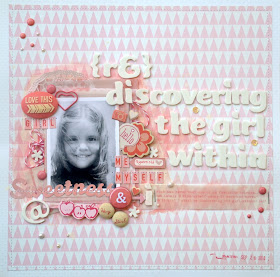
Anastasia
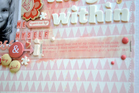
As soon as I heard about the monochromatic challenge, I knew I wanted to use pink and I wanted to scrap myself... which is rather strange, since pink has never been one of my favourite colours, thus the theme of the layout as well.
Even the journaling is printed in pink fond on vellum paper
...And yes, that's me on the photo, when I was about four years old :)
Anna
I went with green as my colour. I really enjoyed creating this as I just pulled out some green papers and embellishments and got creating, it cut the choice down of all the other lovely colours! The greens went well with this photo I took in Spain of a lovely view.
Cari
This might be the first time I make a monocromatich layout and the first time I use purple! I just can say I loves the final resul It was so easy to choose papers that I should do monocromatich more often. I use just two papers! The one for the background from American Crafts and a purple page from the basics collection from Pebbles.
I also use some purple embellishment from my stash.
Just love this little lego like's brads. I have them for more than three years and it's the first time I used them!
Daphne
The colour RED normally is not really MY personal choice when selecting paper for a new layout. So having been 'assigned' to scrap a monochromatic layout in RED - it really was a challenge for me!
I started going through my basket of scraps and picked all the reds I got! Wow - I have lots! But how to use all of them? Easy! I punched several shapes and started layering. I also added some red and white paper straws I stumbled over on our last shopping trip.
Luckily I had an instagram picture in black and white from my husband, while waiting for the coach to arrive to get us to Heathrow airport.
Hilde
My youngest kid is a creative one, in many ways. He wanted to test out if the loan mower could be used to pull him on his long board:
Title: The optimistTo create a true monochromatic layout, I inked all white parts on the patterned papers with yellow ink.
Photoshop + me = not friends. I printed my photo in b/w and simply used a yellow marker on the parts I wanted to be colored. Easy peasy :-)
PS. This didn't work out as DS planned. The combo of long grass and small wheels, was a bad one. This made have worked on a smother surface, though :-)
Jinny
Monochromatic looks have never been my strong suit, but I knew that I wanted to try to rock one with sonogram pics of our new baby. So, as soon as we found out he was a boy, I dove into my blue stash and put together this number.


My colour was orange, and it made me realise how many different paper companies use a very similar orange colour with their papers - there is MME, October Afternoon, Studio Calico, Simple Stories, Jillibean soup all on this page. I balanced the orange with some neutral browns and creams, and a few splatters of orange mist too.
Rachael
I had this photo of a friend & ME which I have been wanting to scrap....
I know straight away which color I was going to work with.... BLUE!
Stephanie
I chose to work with brown for this monochromatic challenge because I knew I had a lot of woodgrain and cork in my stash of supplies. Earth tones like brown are perfect for autumn layouts, and nothing says autumn quite like a Pumpkin Spice Latte from Starbucks!
Brown can quickly create a solemn look, so I knew I wanted to combine patterns to give my layout a more festive, celebratory feel. I paired the woodgrain paper by Maggie Holmes with a fun polka dot pattern from Amy Tangerine's new Cut & Paste collection.
Petra
I used a mask from Heidi swapp to make the butterflies and then I sewed on them to add some texture and detail.
On this page I used a chipboard from A2Z Scraplets which I stamped on and then sprayed with dylusions mist. One of the flowers are from Prima and the rest I made myself using flat flowers from You Do.
I used slightly different shades of teal to get some dynamics in the page and combined with white to get contrasts.
The title is stickers combined with a cut out using the Silhouette.
Guest Designer - Sue
I can't resist scrapping photos of my great-niece and nephew and here they are all snuggly in their jim jams. I love to use black and a splash of colour for my pages, it really makes them pop. I'm on a mission to use up some of the mountain of stash I have and this paper is an old one from the Fancy Pants Glimmer range called Summer Soiree. When it was all stuck down I could see the page needed more texture than just the distressed edges so I added some hand stitching, a button, some ric rac and the little black stars which were skulking on my desk. I've gone with the current trend for chevrons and used a strip of Washi tape, too.
Manufactured by Photocentrics whom also manufactures clear stamps.

The Stampmaker is the perfect tool if you like to design your own stamps.
One lucky winner will get one set of stamps (size A6) of their own design. You could make one single size A6 stamp or several smaller that fits in that size.
You can also order your own clear stamps at Photocentrics.
Please link up your layouts to the side bar, which monochromatic colour will you pick?!


What gorgeous DT examples!
ReplyDelete