Please include both your layouts!
Here's the design teams lifts; sadly Katherine has now left the team and we welcome Katarina!
Anna:
I found it quite hard to pick one of my layouts to scrap lift, as I like all my layouts to be different but in the end I settled on this layout from 2011 as I really liked it. I made sure my new layout was different with the colours I used.
Cari:
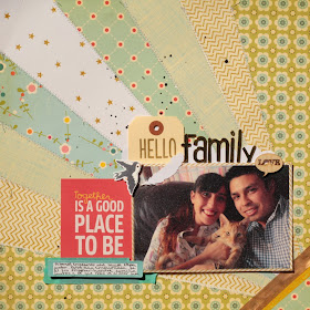
For this challenge I decided to re-do a Lo I made back in 2011 when I was starting into scrapbook, I didn't hace many supplies and neither the skill of taking good photos, anyway is a Lo I like a lot, and I love sunburst!
This time I use a photo of my family and change the side of the sunburst, and the colors, I love the new result!
Hilde:
I usually scrap with 7,5 * 10 cam photos, but I had this photo I wanted to be larger, 10*15 cm. So I browsed my 2012 layouts to see if I could find a design suited for a larger photo. I picked this layout made in September 2012:
Here is my new layout, featuring my youngest kid (laying in the snow) and his BF laughing about his big failure when attempting to do a trick with his snow toy:
For details/close up photos, please visit my blog (see right hand bar)
Jinny:
This was a super tough challenge for me, as my style has changed so much over the years. But I dug into my summer 2011 files and came up with this fun page to lift.
I haven't used that leafy stamp in ages, so I couldn't resist bringing it back for this take boasting lots of new goodies from Elle's Studio and a darling, vintage, Valentine image from JBS Mercantile. And instead of chipboard numbers for my hubby's age, I used the same idea to model the year.
Kat:
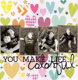
I dug way back into my scrap archives and picked one of my favorites...it's a layout from 2010. Here is the original:
Here is my new take on it:
I kept to the rainbow theme, the black and white photos and the black lettering. And now with all this color I think I'm ready for Springtime!
Katarina
I love to scrap using lots of mists, inks and embellishments. For this challenge I chose this LO that I did 2010.
and this is my scrap lift
My personal style is there... but I narrowed down the white space even more changed the color palette but kept the clusters and the romantic touch.. and I added stencil patterns that is a bit more visible than on the original LO.
I choose this page all the way back from 2011 to LIFT and it was not easy because I still like this page and I wanted the LIFT to stand up to it.

And this is what my new page looks like:
I added some aquarelle colors on the background, some stitching and tilted the design. But I kept the overall design and the elements like 3 smaller photos, flowers and bling swirls. I used the Beachcomber collection from FabScraps.
What a great job everyone did! Hope that inspires you to get vlufting if so we would love to see your creations! Please link them up to the side bar for a chance of being our guest designer for a month.
Happy scrap lifting!


Lovely - TWICE as much inspiration from the team!
ReplyDelete