We have another great sketch to inspire you today, Valerie has created this sketch inspired by Jinny's April challenge layout.
Here are the DTs takes on it:
Cari
I love this sketch is simple and easy to follow, It didn't take me much on finish my Lo. Last month I went to Brazil to meet some friends, the picture is me, walking for one amazing street in Sao Paulo.I recently bought some neocolor II crayons, It's extremely easy to make this watercolor clouds with them I do recommend them!
Hilde
My neighbour has a pond with koi fish. Luckily he has lots, and they breed naturally so quickly that he need to sell 50-60 each summer. If not, I think my cat Ponky would have been in big trouble if he discovered this:
I streched the design a bit to fit landscape oriented photos, and I used the same one twice. Who says you can't *lol*?
Here is a trick for you when using busy background papers: go with a completely different color in the title - it takes the focus away from the busy paper and lead your eyes to the photos. Imagine the tiltle in brown - your eyes would immidiately be drawn to the busy, right hand side.
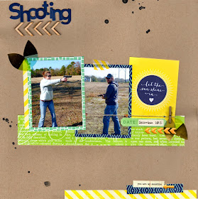
Seeing as it's Mother's Day here in the U.S., I thought it only fitting to scrap a couple of pics from one year ago today. I've combined a number of amazing manufacturers, including Jenni Bowlin, Basic Grey, and Elle's Studio, to create my take on the sketch, which I've rotated 90 degrees to the left to better accommodate my horizontal pics.
Kat
I loved the sketch and I adored Jinny's original layout. When it came time to do my own layout, I didn't follow the sketch that closely. However, I did pull in elements that I loved and stuck to the sketch closely enough that you can tell (sort of) where my layout came from.
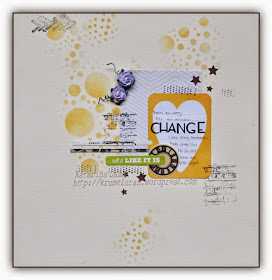
This was such a great sketch, and I actually used my project life cards to make a LO without photos, about my biggest change in life right now, being divorced. 

I don't normally "follow" sketches as I'ma bit of a rule breaker but this sketch worked perfectly for me on the Ruby Rock It Banner background. The additional banners etc are from the now defunct Kanban collection but work well with my "SmilERs" layout.
Please link up your takes to the side bar, we would love to see what you do with this lovely sketch, you have until June 8th to enter!


No comments:
Post a Comment
Thanks for your comment, don't forget to upload your Sunday challenge layouts to Inlinkz in the sidebar!