Wednesday 30 March 2011

Wednesday Extra: Altered Canvas with Jules

I love working on canvas and thought I'd share one that I made for a friend recently, along with a few tips for having a go at your own.
 
First you need to choose your canvas. There is a wide variety of sizes available, and they are relatively inexpensive to buy. I chose a Windsor and Newton 24"x24" deep edge canvas, which I then primed by coating in white gesso. I did this stage outside, using the plastic wrapping as a protective sheet, because I tend to be a messy painter!
 
 
Once the gesso is completely dry it's time to add your base colours. I started off with a coat of grey acrylic paint, and then added a white base for my photo. I also stamped some areas using white acrylic paint and bubble wrap, and then sprayed some red mist.

 
The next step is to add your papers. I created a mat for my photo using red Bazzill cardstock, and added some black and white patterned papers and a sentiment from the Echo Park 'Be Mine' collection.

 
Finally, add photos and embellishments to finish! I added a 10"x8" black and white matt photo, butterflies cut from the Bazzill and Echo Park paper using a Cuttlebug and finished with red gems, Pink Paislee artisan tape, WRMK rub ons, a Glitz Design pom pom, and Scrap FX chipboard butterfly and swirls, which were inked with charcoal Chalk Ink, misted and finished with silver gems.


Here are a few close ups:


If you've altered a canvas, we would love to see!  Upload your project in The Studio's community gallery or link us to your blog. Thanks for looking!

Saturday 26 March 2011

27 March - Card Challenge

Hope you all had fun with that last challenge! I loved that sketch and just had to play along with the layout team. This week we've got a card challenge for you - and I think this one will definitely make you think outside the box.

We see them all the time in the card shops, but don't make them very much on our own...the challenge this week is to use a photo on a card. Let's have a look at how the design team was inspired by this challenge:

Valerie
I took this photo of vintage birthday candle holders a few months ago. I never intended to use it for anything, as I was just practicing with the focal length on my camera. I hung onto it though, and since then it's appeared on a layout and now this card. I printed the photo onto non-glossy cardstock and kept my design simple so that the focus would be on the photo.

Brenda
This picture was taken at one of our 10,000+ lakes here in Minnesota.  I stamped on a photo with white Staz-On.

Fabi

I must say this was my favorite card challenge ever! Wow, what a creative idea, to use a photo in a card? I had a hard time to choose the photo and then saw this one on my stash...small, already cropped.

Natalie

I used this challenge as the perfect excuse to use one of the many vintage photographs that I have collected over the years. There are some amazing websites that offer these for free but you can also simple google 'vintage photographs' to find some stunning old time piccys :) This image is from this fabulous place.
I printed it out onto cream cardstock and then used Old paper distress ink along the edges to give it a vintage feel.

Rossella


The man on the photo is my favourite man on the world....my love! Is been wonderful to create a card with a photo, really my first one!

and our Guest Designer Pati
For this challenge I made a card using only a simple paper, as internal distress back in frame for photo with the colors symbol of the city of São Paulo: red, black and white! In the title card used a bit of brightness to
give a charm to the most, after Sao Paulo has a lot of life energy, is a charming city, modern, cosmopolitan and has a glamorous all up there in particular. I love this city! 

Now it's your turn - we'd love to see how you incorporate a photo into a card. Link up your creations for a chance to win this month's prize!

Tuesday 22 March 2011

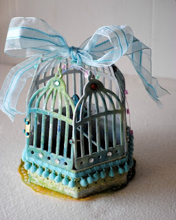
Wednesday Extra - Potpourri Birdcage by Irini

Altered birdcages are becoming more and more popular.  Let your creative imagination take flight with this stunning project by Irini.


Using Tim Holtz dies, cut a bird and birdcage shapes from chipboard.

 
Cover die cuts with gesso to brighten the chipboard and prepare the surface for mist.  Irini created a beautiful effect by layering Maya Road buttermilk cream, Maya Road turquoise metallic, Adirondack Colourwash in Stream, and Studio Calico Mr Huey white.  To each piece she added a layer of Tim Holtz' clear distress crackle paint.
 
 
Build a base for the birdcage from chipboard and color it like the die cut pieces.
 
 
Add a hinge to create a door and assemble your cage.
 
 
Before adding trims, Irini highly suggests coating the birdcage with Mod Podge.  Once dry, add your potpourri (or in Irini's case, Whittard of Chelsea "Very, Very Berry" Caffeine Free Fruit Infusion) and perch your pretty little bird.
 

Thank you for sharing, Irini!  Do you love birdcages? Have you altered one?  Feel free to let us know in the comments.  Thank you for stopping by today!

Sunday 20 March 2011

20th March - Layout Challenge

Hope you've been enjoying the spring sunshine where you are, it's been lovely here lately!
This week's layout challenge is to use this sketch...
There is a twist though, we would to see you add RUFFLES to your page!

Here's what the design team have come up with this week.

Anna
 For my ruffles I used fabric and pushed the material though the sewing machine so it bunched up to make the ruffles.
Heather
I loved this sketch and I plan on using it again and again because it's so versatile!  Lots of fussy cutting here you can see but the flower/doily paper just screamed "fussy cut me". To make my ruffle I just punched the paper with a lace punch, gathered it together and stitched over the top. I shaped it a bit to resemble a smile. I incorporated my title into my journaling to help keep more of the black space around the rest of the layout.

Lisa
Nadia
Teresa
This is a photo of my youngest Elouise on a fine autumn day last year. The sun hit her blonde hair, making her look just radiant. Plus she was out to lunch on a weekday with Mum and Dad while her brother and sister were at school. That alone was enough to put a huge smile on her face!

Papers by Prima, resin heart from Websters, My Favorite Things scallop die, Making Memories sticker letters, ruffle ribbon by Bella and butterfly punch from Martha Stewart,

Our guest designer Pati
On the page Little Girl, I used a photo of me with 6 months on the porch of the house where we lived. In the tags under the photo,  I was say the first daughter and granddaughter of the family, which meant that our house was a special place, where I have great memories! It seems it was another day that I was just a little girl! How time flies!

A few of the other ladies from the other design teams have joined in this week to give you even more inspiration!

Jules
Julie
Tessa
Valerie
I love a great, simple sketch and knew exactly what photo I wanted to use for this one. Then I saw the 'ruffle rule' and had to think of a way to make it work on my boy page.
To make my 'boy' ruffle, I used twill ribbon and simply bunched it up on a piece of super sticky red line tape:
Isn't it amazing how different all these layouts are but all made from the same sketch?! We would love to see what you do with it, don't forget this month you could win goodies from Scrap with a V.

Wednesday 16 March 2011

Wednesday Extra - Altered Monogram by Tessa

Happy Wednesday, all!  My ever-growing love of yellow has now infiltrated my decor, and my boys happily don't mind.  While doing a little redecorating, I realized that my large, "americana" style "B" was not going to work any more.  My solution?  Tear off the paper and start from scratch.


This papier mache monogram is about 3 feet tall and 1.5 feet wide.  In its naked state, it is a kraft color.  I could have painted my monogram, but I wanted to cover it in papers from two of my new favorite lines - For the Record by Echo Park and Portrait by Crate Paper.  I also used some vintage sheet music from Scrap Rat.


I started by dry-fitting my pieces.  Sometimes I used my ruler to guide my cuts, and sometimes I just made a crease in the paper by pressing it against the monogram.  If you're too nervous to freehand cut, you could trace the letter onto your papers first.  I wasn't too worried about perfect edges as I planned to ink all of the edges in the end.


Once I was happy with the arrangement, I grabbed a bristle brush and my bottle of Mod Podge.  I chose glossy Mod Podge for this project, but any similar product or finish would work just fine.  I worked with one piece at a time, applying the Mod Podge to my letter, laying the paper down, pressing out wrinkles, then covering the paper with more Mod Podge.  I only ran into a few bubbles, which I easily fixed by pressing into them with the handle of my paint brush and adding more Mod Podge.


As you can see in this photo, I edged some of my seams with a piece of punched cardstock and patterned paper.


When the front was dry, I applied papers to the inside and outside edges.  I left the back bare.  While waiting for the Mod Podge to completely dry, I made my embellishments.


I made rolled fabric flowers in gingham and mustard yellow, as well as a lace and felt flower with a pearl center.  I altered several flowers from K and Company (canvas and tulle) by scrunching the centers.  Before adding my flowers, I took a walnut stain ink to the edges - the ink blended beautifully into the Mod Podge and was soaked up by the kraft papier mache.  I really love the effect.  Once the monogram was dry, I arranged my embellishments and adhered them with hot glue.


I plan to create a collage of the letter B in my livingroom, this one being the largest and most detailed.  As my collage progresses, I'll post photos in The Studio's gallery.

Thank you for stopping by today!  If you have any similar projects to share, or if you give this one a try, link me to your altered alpha here in the comments or post in the gallery.  We'd all love to see. Have a great day! Tessa

Saturday 12 March 2011

Sunday March 13 Card Challenge

Congrats to all you winners on the blog hop! How great to read all your comments and see all your takes on that great Pencil Lines sketch! This week at The Studio we've got a fun card challenge for you. We challenge you to make a card inspired by your favorite song.  Here's some inspiration from our design team to get you started:

Valerie
One of my all time favorite songs is and your bird can sing by the Beatles. I let that inspire this card. The birds, the sun and clouds...all remind me of the cheerful melody of that song.


Brenda
My card is based on the song "Walking on Sunshine" by Katrina and the Waves.  That song always makes me happy!

Natalie
I recently watch the movie Easy A and loved the scene where Emma Stone is singing the Natasha Bedingfield song 'Pocket full of Sunshine." I now have that song on my brain...hehehe...and when this challenge came up I knew I would use it.
The denim pocket is from a pair of my daughters jeans she had as a baby...perfect size for a card!!

Rossella
My favourite song is "Stairway to Heaven" by Led Zeppelin. This song has been dedicated to me from my love at our first appointment! Will be always my love song!


Fabi
I loved this card challenge as Im a music person. I listen to everything so its not easy to say I have a favorite music. But when i read this assignment one music poped in my head, so I needed to scrap about it: I need you now from Lady Antebellum. So here is the card...


Its an envelope like card, and I think the result was pretty romantic, isnt it? :)


Now I want to see your take on this one! Cheers

We also have this beautiful card from our March guest designer, Pati:


I chose the song "What A Wonderful World", of Louis Armstrong, what I love, to wish a wonderful world for my nephew who will be born next week!

I am an optimistic person, so I sincerely hope he finds a more just and more loving world to live in!

Now it's your turn! We'd love to see your cards so be sure to link them up in the sidebar!