Here are the design teams takes;
CariI usually don't use skechs but anytime I use one I love how fast I can finish my layout, tha hardest part of the work is already done with a sketch! I decided to use only one photo and complete the grid just with papers and embellishments.
I love grids because you can use differents papers in just one work. The papers are from the collection "From me to you" from Pebbles and I simply love it!
Daphne
Sketches are my favourite way to start a layout - always an easy way to get back to scrapbooking as well!
I kept quite close to the sketch except for the left bigger picture and patterned paper. The title fitted better on the bottom as well. And I DID include woodgrain - can you spot it?!
Hilde
November is Movember, you knew that, didn't you?
My husband is trendy, and of course he lets his moustache grow the entire month:
I had to ink the wood flags in black, or they weren't visible at all. Masculine papers made it easy to make a masculine page.
Does your husband do the Movember?
Jinny
I took a few liberties with my take, as it is very uncommon for me to have photos that would likely be trimmed to the tiny size of the squares in the sketch, but I kept the grid design...
and threw in lots of snowflakes for the circular elements...
as inspired by the trendy, chalkboard title from Simple Stories. I just picked up their December Documented collection and can't seem to put it down. LOVE!
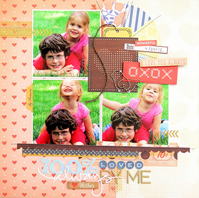
I love a sketch challenge and decided to use a bigger photo over the grid the pattern using a chipboard polaroid frame. I decorated each of my squares and then found this 'beautiful' photo of my kids.
Petra
This challenge was easy peasy for an engineer. I just took out my ruler and made a grid ;)
On this page I used Crate paper Flea Market and Crafter's Workshop stencils
Guest designer -Gosia
"In my country the beginning of autumn was totally perfect! Days was sooo bright and sunny, sky was azure and trees was full of colorful leaves. One day of October, after work, I took my Sister's camera and I went to nearby park. It was really amazing idea. For the rest of my day I remained in very good mood.
This one time, I didn't rampage with mixed-media, I focused on pure base with fine gold splashing.
To this scrap, I used mix of few papers like Glitz Design, Studio Calico and American Crafts.
I didn't stamp the background, as everytime, but I cut off stamped stars fro 3rd Eye. I also used arrows and space for journaling with wood theme.
Thanks to Gosia for being our guest designer this month, she did a great job!
Get creating and link your layouts up to the side bar for a chance to be our guest designer.


