Saturday, 31 December 2016

September's Winner and Favourites

I thought I would just sneek in one last post of the year!

As it's time to catch up again... here is our September winner and our favourites!

The winner is....

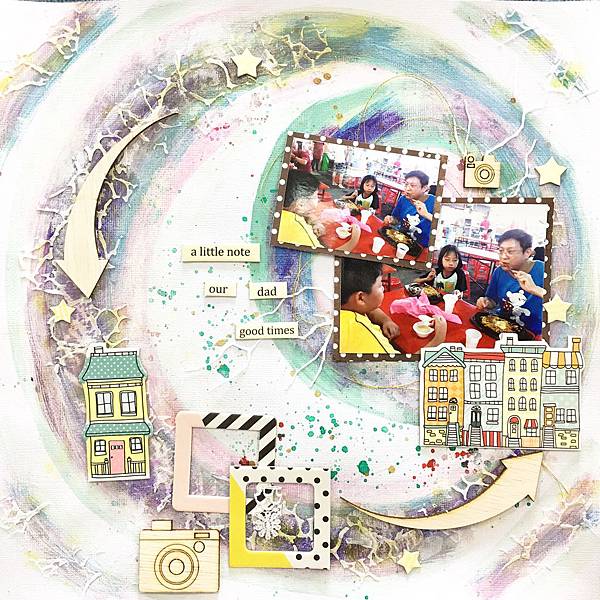
 I really love how the watercolours were used here for this challenge, a beautiful layout.
Congratulations Tone,  please email me!

And our favourites are...

Daisies Scraps from our Frames challenge
img_2763
Hannah for our watercolour challenge


IMG_3551.JPG

Suzanne Franin from our watercolor challenge.
img_6131.jpg (2567×2577)
Lovely layouts everyone, thank you for joining in with us! 
See you tomorrow for our first challenge of the new year!

Sunday, 18 December 2016

18th December - Table Setting

Today is our last challenge of the year, it is another ....
Table setting; use this table setting as inspiration for your layout.
Set a pretty Christmas scene with our Winter’s Wonder Dinnerware, surrounded by natural elements. Hand-carved hardwood chargers atop water hyacinth placemats. Handblown hobnail glasses. Snow-kissed faux spruce trees alongside handcrafted sisal reindeer and napkin rings. Plus, plaid linens, right down to our embellished reindeer table runner. Winter wonderful from Pier 1.:

Jinny
One of the first things I saw, in the inspiration photo, was that trio of trees in the center of the table and the little mimics on the plates.  So, when I found these photos of my littlest, helping to dress our own Christmas tree, I knew they'd be a perfect fit.  I was also drawn to the woodgrain foundation of the table itself, not to mention all the scrumptious plaid; and of course, I couldn't help but toss in a reindeer or two.  Nearly everything I used came from October Afternoon's Under the Tree Collection.

Rachel
I think this would be my dream table setting for my family at Christmas! Here is my table setting inspired layout which I have added gold with my Christmas colours and of course a deer. My Christmas tree, snow flakes and deer are cut files from the Silhouette Design Store and my paper collection is by Kaisercraft. I wish you all a very happy and safe Christmas and hope you will find some time to scrap and join us for this challenge.


Raechelle
The wood grain, burlap, and plaid grabbed my attention on this beautiful place setting. I cut some fringe to add some texture and to replicate the tree branches. The goblets inspired the dots. Some burlap stars and gold spray must added the finishing touches to my layout.


The sweetness and slightly rustic and whimsical look of this tablesetting are reflected in my paper choices - a sweet print and a woodgrain, along with a small stripe instead of the plaid.  I picked up the sparkle with some glittery enamel dots.


Tracy
I found this table setting to be just stunning!  All kinds of things were screaming at me when I looked at it.  The colors, the plaid, the pops of gold, the pine trees, the deer...oh my!  With the help of the Cozy Christmas collection by My Minds Eye I was able to incorporated all things mentioned above into my layout.


Vivian
The color scheme is what got most of my attention from the photo. I used mostly Teresa Collins' "Tinsel & Company" for this layout. Of course, I added hand-stitching for extra whimsical effect.

Guest Designer - Laura
I am so happy to be back a second time this month!  How awesome is the inspiration photo? I seriously would love to eat at this Christmas table, I love everything about it!  The texture of the burlap, the crystal, lots of layers, the sweet deer and twiggy Christmas tree are all referenced in my layout.  As well as a “placemat” to hold all of my elements in my focal area! Thanks so much to Anna and the team for having me this month!

I hope you enjoyed all that inspiration, if you do join in, please do link up your layouts to the side bar.

I would like to take this opportunity to thank everyone who has joined in with us this year we have loved seeing your layouts and to wish you all a very Happy Christmas, have a wonderful time.

We will be back on the first day 2017 for another challenge!
XXX

Sunday, 4 December 2016

4th Dec- Sketch

It's that time again for another...
Sketch - Made by Anna- Inspired by Raechelle's first DT layout. A nice simple one this time!

Here are the design team's take on the sketch...

I love the big circle from the sketch as there's so much you can do with it, I went with a painted circle of lots of christmas shapes to go with the photos of my niece's first Christmas. Sorry to the poor photo it's hard to take metallic and glittery papers!

There's not much to say about a sketch, but I did want to mention that I flipped it to showcase these pics of my sweet, little niece, with her mom and dad, better and used Creative Scrappers' Basic Hearts cut file and lots of Citrus Twist kit club goodies.  That darling deer, as well as the pink butterfly, came from Pretty Little Studio.


What a stunning sketch. I have kept true to the sketch but added a beautiful floral cut file to be the feature of my layout. I look forward to seeing all your creations x


I enjoyed creating the original layout that this sketch was based upon, but wanted to do something different this time. I created my base by fussy cutting the circular shapes from the patterned paper and added die cuts and additional fussy cut pieces to finish it off. 


When I saw this sketch, a piece of gold patterned paper immediately came to mind.  I used it to highlight a lovely scenic view, and tucked another small photo in the bottom right corner to help reinforce the idea of scale on the page.


I just love playing with circles so it was love at first sight for me when I seen our sketch challenge.  I did mix things up a little but that's what I love about sketches, they are such a great starting point.


This is a classic sketch that can be molded in many ways. I'm still wanting to make Fall layouts so I reached for Doodlebug Designs "Flea Market" line. The leaf circle is a die cut from the Silhouette store. I added random stitching to the the circle and other spots in the layout for effect. Thanks for looking!


Guest Designer - Laura
I am so thrilled to be guesting here at The Studio Challenges, this month! I loved this sketch as was super excited to play with it, it is right up my alley with the suggestion of 2 smaller photos, the large circular element and subtle layers!  I really wanted to play with the “Mistletoe Kisses” collection by Simple Stories for this layout and document a little bit about our Elf on the Shelf – because seriously those elf embellishments are irresistible!  I decided that it would be fun to adapt the circular element from the sketch to a Christmas ornament and created a string art style cut file for my page.  I ended up having to relocate my title because of the size of it, but added a sticker to act as a subtitle in the original suggested spot. I had fun with embellishments and wrapped up my layout by incorporating some journaling into my take on the sketch. 
I just love all the different designs that came from this one sketch, the design team did a great job! We would love to see your takes on it, please link up your layouts to the side bar.

Sunday, 20 November 2016

20th Nov-Table Setting

Hello and welcome to another challenge! 
Today's challenge is ...a Table setting; use this table setting as inspiration for your layout.

I love how inspired I got when I really looked at this table setting, it really said autumn to me. I picked the colours for my layout from it, the bit of green from the moss etc, I used Thickers the same texture and colour of the throw and blind, a bit of black with white pen like the blackboard, a wide ribbon that's similar to the place mats and a wooden button from the cushion!


I was inspired by the neutral palette but may have gotten a little carried away with my one non-neutral, pink.  (Insert sheepish grin.)  I couldn't resist using a gingham print, which is one of two things (The other is the music flair button.) that did not come in a Citrus Twist kit at one time or another, as inspired by the pillow, on the bench, in the background.  I also incorporated gold elements to mimic the flame of the candles and found myself further inspired by all the woodgrain elements.


This to me is all about family being together and that is what inspired my layout, my beautiful family.


Raechelle
When I first looked at this photo I wanted to jump right in to sit down and enjoy a meal at this cozy table. So many things captured my attention; the texture, especially the burlap, the plaid, the wood grain, the soft creams and whites, and all of the natural elements


Place-settings as inspiration, you say? Well then, I set "6 places" on my layout to echo the long Thanksgiving table back in 1983.


I see... the banquet table, the place settings, the centerpiece, the holidays... but most of all, the warm loving feeling of family all together!  From this table setting inspirational photo, I got just that!  A layout created with family gathered around our holiday table.  


Vivian
Fall is my favorite time of year. I love working with Fall colors and any related photos. A table setting with a pumpkin on it was all the excuse I needed to make this layout. The hardest part of this layout was the hand-stitching since I used twine that was rather thick. Everything else came together rather quickly.


Guest Designer- Hannah
I use maple leaves ink and wood to make autumn style.

I hope you like today's challenge and find it inspiring. You have until 4th December to enter this month's challenges.
Happy Scrapping!

Sunday, 13 November 2016

July Winner and Favourites

We have so many lovely entries in July picking a winner and our Favourites was difficult! Thank you to everyone who joined in, we loved looking at them.

Our winner is....

Csipke & Papir

Please email me (Anna) at: thestudiochallenges@gmail.com to become our guest designer for a month.

And our favourites are....

Chid Kids Crafty Corner


Autumn


Congratulations ladies, lovely layouts!

See you again next week for another challenge.

Sunday, 6 November 2016

6th Nov- Colour Palette

Today's challenge is this lovely Colour palette.
Here are the design team's layouts...
I am so sad that this is my last project for The Studio DT. I had so much fun working with this team of amazing and talented ladies as well as being able to share some inspiration with all of you. I'm sure we'll all meet somewhere on our creative journey. I hope you enjoy my page and hopefully see you on my blog! x

Jinny
Color challenges are TRULY my favorite kind of challenges!  I love how they force me to dig deep into my stash for just the right color match, because I always come up with buried treasures.  I softened the brown but tried to stay true to the rest of the palette, while adding in just a touch of aqua for additional softness.  Plus, aqua is my favorite color to scrap; and I tend to use, or maybe overuse, it as a neutral ;).
Rachel
What a stunning colour palette! I am a fan of sunflowers so I incorporated these into my layout. I look forward to seeing your creations.


Susanne

I was lucky enough to find a suitcase themed paper which included all the colors of the inspiration palette.  I mixed it with another print and some neutrals, and then added a little stamping and embossing too.


I am in love with this color palette and I am more in love with sunflowers!  It's a win, win challenge for me.  I also ended up creating a layout based on the way the color bars are showcased.  It really inspired me.


Vivian
The color palette is beautiful, but I did have to go "digging" into my stash to find it. With me in the photo, I felt compelled to reach for some flowers that matched the color palette as well. Happy scrapping and looking forward to seeing what you do with this challenge.


Guest Designer -Hannah
I use those colors make it like a lake that is my family travel place in TAIWAN.
I used a big circle to make it just like sun shine on the lake. The little circles are just like bubbles.

I hope these layouts have inspired you to give these colours a go, if so please link them up in the side bar.

Sunday, 23 October 2016

23rd Oct - Tic Tac Toe

Good Morning!
Today's challenge is..

Tic Tac Toe; choose any line and include those items in a layout.

Here are the design team's layouts and it's the new challenge for our new DT members...


Middle row for me: paint, thread and punches. I decided to use papers from Marion Smith's NIRVANA collection. I punches circles in some of the paper strips in the paper cluster and arranged blue thread in between the layers - you can see it sticking out on the sides. As usual, loads of white paint with added blue for the watercolour effect on the background. You can see the details and layers on my blog. I'm very curious to see which line you're going to choose.


Jinny
I chose the diagonal of wood, thread, and twine for my page.  Most of what you see here came from Citrus Twist's September and October Main Kits, which included lots from Maggie Holmes' Gather Collection and some fabulous die cuts from Indigo Hills by Pinkfresh.  I absolutely adore all the blues!


Rachel
First row for me, wood, wash tape and flair. I have used the new collection by Coco Vanilla Studio, Make a Wish and a beautiful cut file to add another layer of interest. I look forward to seeing your creations.


Raechelle
I chose the first row across; wood washi and flair. I am a sucker for woodgrain and both the background and cut files were created using wood grain paper. The bright color of the washi is an unexpected pop of color on this layout. A cute little flair button adds a cute woodsy feel.


Susanne

For my layout, I chose the top row – wood, washi tape and flair.  The map paper gave me the idea of doing a layout of a few photos of my family on their Pokémon hunts this summer.  I wanted the page to be fun and busy.  As usual, I have colored my wood veneer.  The dotted washi tape and round flair help to reinforce a diagonal line through the photos.


Tracy
I chose the diagonal line of wood, thread and twine.


I chose the bottom row with arrow, buttons and twine. I immediately reached for the Bella Blvd. - Color Chaos - for this layout to symbolize the various color belt ranks a martial artist must go thru. Plus I thought it went well with the B/W photo. I didn't want "color" everywhere though, as karate is about control and "clean lines".


I hope the design team has inspired you to have a go! You have until 6th November to join in with the this month's challenges, please link them up to the side bar, we would love to see them!

Sunday, 16 October 2016

New Design Team Members

Thank you everyone who applied to be on our design team.
We now have three new members, who I think will be a great addition to the team.
Please welcome...

Here's a bit more about them;

Raechelle
Hello! :)  I am Raechelle (pronounced Rachel) and I live in Conroe, TX along with my husband and youngest daughter. We have a blended family of six children, five girls and one boy. Our other five children are grown and live all over the US, with the exception of our second youngest daughter who is currently stationed in Romania. We are a proud military family! Two of our daughters are active duty Navy, our son is an Army Veteran, and our oldest daughter is a Navy Veteran. We have three sweet granddaughters, although we have only been able to meet one of them. I am a stay-at-home mom for our youngest daughter who has Crohn's disease as well as other medical conditions. Thankfully she is in remission at the time and is able to live a somewhat normal teenage life. 

I have been scrapping for about 15 years now and enjoy pushing myself to expand me creativity. I still marvel at how we can all take a sketch, some photos, paper, and embellishments and end up with unique expressions of ourselves. You can see more of my work by visiting my blog :: http://raebellus.blogspot.com/ 


Tracy P
Hi there!  I'm Tracy and I'm from NW Indiana.  I live a blessed life with a great supportive husband and together we've raised a happy/loving blended family of four. 
I started scrapbooking in 2003, by taking a local class out of curiosity, and that's all it took!  I have been addicted ever since.  In the last few years I have been able to spend more time creating and it's now become more of a lifestyle rather than a hobby. 
As for my style, that's really hard to pinpoint since I am all over the place.  Sometimes it depends on my picture or my product or even my mood but I do tend to lean towards a more simple, clean look.  However, I'm always up for a challenge and for trying new techniques, which I feel keeps me up to date with all the new scrapbook trends and pushes me from my comfort zone.

Vivian L
Hi, I'm Vivian and I'm from Indiana, but now reside in Texas. I started scrapbooking in 1998 when it was nothing more than a few decorative cutting scissors to work with. Since then, I have spent many years developing my own unique style. I love playing with die cuts for my cards and 3-D projects. But for my layouts, I tend to stay with the clean look with lots of negative space. Scrapbooking eventually led to my second love, photography. For both of these creative styles, my favorite subject is my son with his big, blue eyes.
You can find me at www.vivansdesk.blogspot.com
Thank you

Please come back next week to see the new members first challenge layouts. I can't wait to see what they came up with!