Sunday 29 August 2010

Sunday Challenge

How are those cybercrop projects coming along? We've enjoyed looking at the ones you've posted already and hope to see some more before 4th September. There have been some really ugly papers on show after last week's task too. Brilliant!! It's the final challenge of August today and you can link it using the inlinkz in the sidebar so that we can all admire it :)

So here's a new challenge for you:

'This is something that everyone will be able to join in with! Hopefully this will encourage you to go out with fresh eyes to take in your surroundings. Even if you can't get out and about at the moment, you can search online for a picture :)

Scrap about a local landmark, and what it signifies to you. Maybe it's the first thing you see when you step out of the house, maybe it's a monument in the centre of town. It doesn't have to be something that other people would consider significant. Enjoy!'


Amanda: 
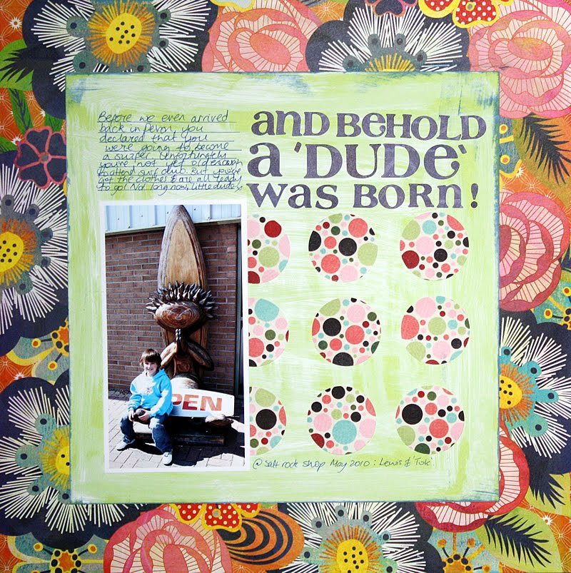
Technically this landmark isn't in my hometown, it's about a 90 minute drive away, but it's one of the things that reminds me of home. It was one of the first places we visited after moving back to the area, so I thought I'd focus my page on that.

Surprise, surprise, I used mists on my layout! Is everyone bored of seeing them yet?! I did use a new product though - that Tim Holtz Tissue Tape. I have to say I think you might be seeing something else crop up on a lot of my pages from now on!

Andrea:

I found a picture of my high school gym which is known simly as The Dome. It is a very important landmark in my town. It houses the gym and the auditorium. It is actually supposed to resemble a baseball . . . but it often gets confused for a golfball or an alien ship!! It was built in honor of Harmon Killebrew, a retired major league baseball player! I found this picture of it in my old pictures and I mounted it on the school colors (red, black, and white). I then mounted the picture on a misted piece of white cardstock. I added a ruffle of red ribbon and stapled it under a star. I added another strip of ribbon and stapled it at the upper corner. To finish it off, I added the journaling in label strips and markers!
Happy Scrapping!

Anna:Across the road from us there is a Post Office in our village and I have lots of memories when it used to be a busy little shop as well. I used to go in there and get my little bag of jelly teddies!! It is sad now though as it is now only a part-time Post Office with no shop. But it still is one of the popular landmarks in the village and one I see when ever I leave the house and we still say 'we live opposite the Post Office!'

Fabi: Here it comes with the little plate (actually a refrigerator magnet) added.
Basically I wanted to use a big photo as main part of the layout and used 2 colors of mist to have a cool and simple layout. The journaling talks about how I was impressed with the city and I've added a touch using some stickers instead of writting. Do you like it? :)

Lisa:
I love that we can walk to such beautiful places from where we live. This is one of my favourite places we go.

Nic:
I love old buildings and this local landmark has been a long familiar sight. I first visited this tudor relic when at school on an art trip and still have my sketch from this occasion! My journaling reads: "I have driven past this familiar landmark umpteen times and visited frequently. I love the sense of of history evoked by this topsy, turvy building and it's quirky charm.

Rebekah: I actually really really struggled with this one. I live in a town just outside Reading and it's fairly leafy and non descript with no major landmarks. There is a nature reserve where we walk the dog, but that's mostly grass and trees and I don't really see it as a landmark. I absolutely love living here but clearly it's not for the landmarks ;) What we do have in one of the parks is a graffiti wall. I actually love grafitti when it's controlled and there are some really talented people out there who are pretty nifty with a spray can. My fiance captured a part of the wall when he took Bailey's photo last week and I thought it would work well with this challenge. I lifted the LO from Jules the bling princess and I love it!

Sara:

I am a city girl at heart. The city is about half an hour away from here as I'm out in the suburbs but it's still close enough to visit regularly. I love seeing the lights of the building reflecting off the water at night. It's one image I could definitely never tire of.

Sue:
Scotland is known for its castles and cliffs. And bad weather. Here is the lovely local landmark that is a short drive from us. It is a lovely cliff area overlooking the cold North Sea, so visitors' children often come here in snow suits even in April.. the wind blows strong.

But the beauty of the area and the majestic cliffs and the ruins of Dunnottar Castle are a lovely attraction to visit. A bit of history, magic and mystery at the 'Cliffs of Dunnottar'.

Valerie:
The town of Middletown, New Jersey is huge. It borders the Raritan Bay and then stretches into farmland and forest to the west. There are lots of landmarks here, historical (this was a significant pass-through during the Revolutionary War) and otherwise. Here's the otherwise:
The 'Scary Clown' of Middletown, aka 'The Food Circus Clown'. His prominent location on a main artery that runs through our town has propelled him to stardom. He's even been featured in the movies. How could I not make a layout about this guy? He's haunted me since I moved to New Jersey back in 1974. So here's what I made:
materials: cardstock: Bazzill, patterned paper: Cosmo Cricket, Sassafras Lass, Studio Calico; stamps: Studio Calico (starburst, label), Close To My Heart (flower); letters: Cosmo Cricket, Making Memories; punch: Stampin Up; spray ink: Tattered Angels, buttons

I decided to keep this layout fairly simple. I stamped the starburst around some of the circles on the background paper, then added small punched circles from the striped paper used for the flowers to add a little fun & depth. The kraft backing page is actually misted with an opaque white spray in, just to give it a little extra detail.

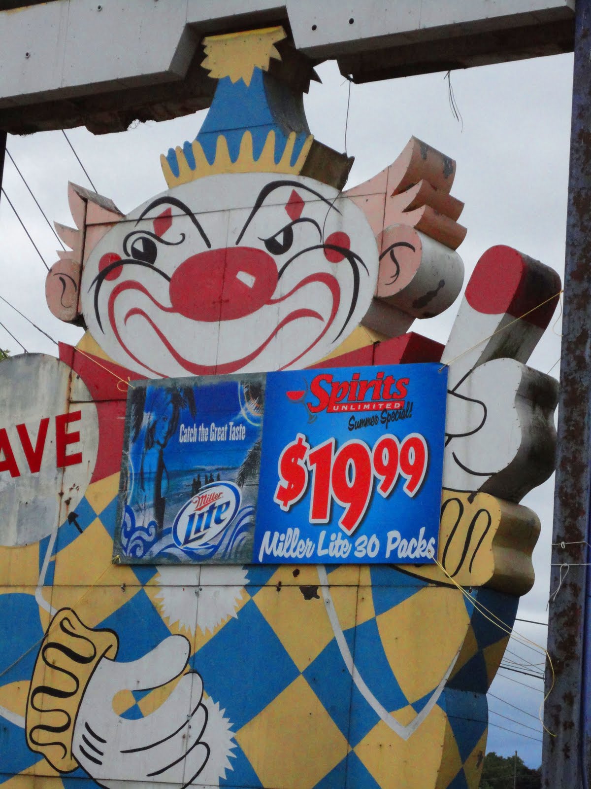
As you can see, the Scary Clown is now employed by a large liquor store, which now occupies the space of the former Food Circus. Even though he's a little unnerving, I'm glad he has maintained his spot in parking lot all these years!

Saturday 28 August 2010

The Studio Pick!

It's time to share another one of our fave layouts. This is a pick from our August entries by Lythan!


Congratulations Lythan, don't forget to grab your Studio Pick badge from here and wear it on your blog with pride!

Wednesday 25 August 2010

Wednesday extra from Val Mangan

This week's extra is brought to you by the extremely creative Val.  Val has has designed these two delightful mini books using page protectors:


Val said:
I love to make mini albums and I'm always on the lookout for something different. When I discovered some unusual page protectors in a local hobby shop I snapped them up. I thought I might be able to make something crafty out of them. After a little bit of trial and error, I came up with this simple mini album format.
here's what the interior looks like:


here's the journaling page on the back of the cover page:


These little albums, which are about 6 x 4, make a great brag book or gift. They are terrific for showcasing a lot of photos quickly and with as much or as little embellishment as you like. The one on the left features photos from a family trip to an amusement park. The "6" album will feature photos of my daughter at age 6. (Wouldn't it be fun to have a library of one for each year?)

If you'd like to give this project a try, a tutorial can be found here.

Sunday 22 August 2010

Sunday Challenge

Amanda's challenge will bring a smile to your face if nothing else!! Ready??

"Right people, no cheating with this one!

Step 1: First of all, go and pick the 2 ugliest, most mismatched papers in your collection, that you honestly can't ever see yourself using. Take a photo of them.
Step 2: Yes, you saw this coming, didn't you?! Make a page using those papers. You can add any other embellishments you like, but those 2 papers must play a prominent role in your design! Take a photo of it.
Step 3: Upload your layout AND your horrendous papers 'before' photo.

The papers must be obviously ugly to begin with - no choosing something you secretly like! Good luck!"


Amanda:
OK, nothing personal Basic Grey or Pink Paislee, (I *heart* you, really) but are these papers supposed to be use-able? I don't hate them, but the number of times I've skipped past them in my stash is countless. They had to go!

I have a big pile of photos in my scrap space that I've printed and not used as I can't find the 'right' paper. What better time to use one of them? This is the resulting page:

I decided to just go for it and let the patterns speak for themselves ;) - I actually quite like how it turned out. Just goes to show that sometimes you need a challenge to kick start those creative juices!

Andrea:
So I found my ugliest papers . . . I think . . . I don't even remember where I got these?! I think I recieved them in a pack of goodies from a crop or something like that! The orange is BRIGHT and ridiculous . . . sorry if you are a giant fan of orange!! The other paper is just so busy and the complete opposite of the orange. I just couldn't resist using them together! I misted the paisley print paper with a sapphire blue glimmer mist to create clouds. The bright orange I used as the title background and for butterflies. My inspiration came from an article in the latest Vanity Fair magazine! Can't wait to see your beautiful creations with your ugly papers!

Anna:
These were the horrible papers! I found quite a few dull and boring papers! I was dreading doing this challenge but once I got into it I enjoyed making something nice out of horrible!
I cut out the swirls from the first paper and punched flowers for the second paper. I didn't like the colour of one of the papers so i rubbed a different colour ink over it to make it blend in a bit more!

Fabi:

Here the details
To me this was the most challenging layout to do since Ive joined the Studio. Come one? uggly papers? No way Amanda lol. The other challenge is that all my stach is in Brazil...and Im in US, buying like crazy lol. So Ive went to a store and looked for 2 papers that doesnt look like me,colors, styles, etc...It took me one full week staring them to come up with something! Now we wanna see what you'd come up with!!!

Lisa:
So, ugly papers.
I had a look through all my old papers and found these. I do love Crate but just not these. I don't really like the colours and they just are far too busy for my liking.

But I created this that I'm actually really pleased with. Just goes to show eh?!!

Nic:
So, I sorted through my stash and found two very old 'ugly' papers, one's which I bought in a sale and have never used as upon reflection, they were not really to my taste and bought because they were in a sale - know what I mean? I've tried to be true to the challenge and pick two papers which I consider to be mismatched, even if it it made me grimace a lot whilst doing so lol! Here they are:


and this is the LO I created with them:


I wanted to create a LO which could store some precious letters received many years ago from my Grandad and created a pocket from a plastic page insert for this purpose. I recently saw a LO in scrapbook inspirations magazine by Piradee Talvanna, which had a gorgeous heart embellishment made from blooms. This inspired me to use the flowers which I hand cut from my 'ugly' papers to create the heart for this LO. I cut and layered the circles from my other paper around my pocket to finish.

Rebekah:
I was sent this Dr Seuss paper by mistake when I placed an order and the seller told me to keep it. I never thought I'd use it. And when I was in America about 5 years ago I bought the geometric paper in multi colour. It's awful; what was I thinking???!!!
I punched the butterflies out of the geometric paper and made flowers from them too. I decided to use the Dr Seuss paper because Connor is really really in to rhyming at the moment. There's a rhyme in practically every sentence he says. He even greeted my neightbour with 'Morning Fred, red, bread'. LOL.

Sue:
And the layout itself :)

Tessa:

I'm going to be diplomatic and say that I don't believe that "ugly" paper exists, only papers that may not work for my style, mood, or project. I've been hiding this paper for years in the bottom of a drawer. I knew that I really liked the flocking on the blue paper and the foil on the yellow-green paper, just not the design. My solution? To use small portions of the paper for the effect of the textures without the dragon imagery.

We are really looking forward to seeing that you get up to as a result of this challenge so please add a link to your layout by 4th September 2010 to be in with a chance of winning this months prize. Don't forget to show us the paper you start off with too!

Valerie:
The challenge this week did just that, challenge me! Luckily, I just had a class where we learned to alter paper with paint and ink. It was an art journaling class but I used the techniques I learned to make a few necessary changes to on of my 'uglies' - so here's what I started with:

Forgive me American Crafts, forgive me Elsie, but wow, these were ugly. I figured I could work with the dots but the leafy paper wasn't going to work with the photos I had. I started by adding some red to the leaves to tie into the pops of red in the photos. Then I painted some black scallops to use as a border, then stamped onto the leaf paper with black archival ink & a flower stamp to make some embellishments. Here's my end result:
Here's a detail of one of the flowers:
Supplies: cardstock, chipboard letters: Stampin Up; patterned paper: KI Memories (dots), American Crafts (leaves); paint: Liquitex; stamp: Close To My Heart; ink: Tsukineko; letter stickers: Basic Grey, Sassafras Lass; journal spot: Autumn Leaves.

Saturday 21 August 2010

*Ahem* Can I have your attention please?

I feel like I should be tapping a champagne flute...

Can we please have a huge round of applause for Rebekah, who has worked so, so hard scheduling this fabby day of scrappiness! I remember way back, when she said innocently: "Let's have a summer cybercrop!"

I think my words were something like "Um, great idea, why don't you do that?" LOL

Well, she did. And she did a pretty good job, don't you think?

Thank you, also, to our fabulous guests, the rest of the DT and all those who are playing along. As always, you have been totally amazing!

Amanda x

10pm A Taste of Summer by Ania

Our Guest Designer this hour is the wonderful Ania :) Her project will have you scrabbling through your scraps and digging out the photos.

"Join me as I'll guide you through a few nifty tips which will make it so much easier for you to preserve your summer-pictures in a small format. Lovely transparencies, gorgeous tags and scraps lying on your table - everything will be utilized to create this minialbum. I promise, this will be fun! :)"

So without further a do, here is Ania's 'Taste of Summer' Class. If you fancy meeting the lady in person and taking a class or two, why not check out PACS Paris in November.


Upload your project inspired by Ania's class by 4th September to be in with a chance of winning a tag prize from Elle's Studio.


And don't forget that we will be choosing our favourite project from the whole cybercrop and inviting the creator the opportunity to be Guest Designer in October. We can't wait to see everything you've created this weekend so please do add a link to the comment section of each project by 4th September.


Thank you so much for joining in today. We hope that you've enjoyed all the classes! Thank you to all the designers who've joined us and to all our sponsors. You're all amazing people :)

We hope you'll all join us again tomorrow for your regular Sunday challenge. It's all going to get a bit ugly!!

9pm Misting Madness by Fabi Ormerod

If you've stopped by this blog, well, EVER, you'll probably have noticed we all love a bit of glimmer mist here on the DT! But not everyone out there is as addicted as we are. How many of you out there love the idea of glimmer mists but just don't know where to start? Well, Fabi has been having all sorts of fun with her glimmer mists for her class today - now's the time to get them out and experiment! I can't wait to give it a go myself. Download all the details here. We would love to see how this class inspires you so please add a link to the comment box below :)

8pm All About Me by Wendy McKee

We're delighted to welcome Wendy McKee for our next class of the day. And you can stick right here for the instructions:

About me...

*Each rectangle is the size 8 cm by 6 cm. Top left rectangle: Cut out two rectangles using the pattern paper called Lola...one 8 by cm and one rectangle 6 by 6. Round all the edges and layer them on top of each other.Add a scalloped edge. Layer on 3 different circles using the pattern paper called Mia.Using some transparency draw and cut out a flower and add this to the circles...then add your journaling.

Top right circle: Cut out a rectangle using the pattern paper called Mia to the size 8 by 6. Cut out another rectangle to the size 5 cm by 6...Layer it so the smaller one is in the middle...add a scallop edge top and bottom. Using a flower punch, punch out two flowers from the paper Lola, add a small circle and some bling.Add to the rectangle and then add your journaling.
Bottom Left: Using the Lola pattern paper cut out a rectangle to the size 8cm by 6cm.Cut out another rectangle to the size 6 by 4 using the pattern paper called Mia. Adhere it all together. Add a scalloped edge to the bottom of the Mia paper.Draw and cut out a flower using the transparency and punch out a small flower and add on top of the transparency flower. Add to the rectangle and then add your journaling.

Bottom Right: Using the pattern paper called Mia cut out a rectangle to the size 8 by 6. Cut out a strip of the pink side of the Lola paper to the size 8 cm by 4 cm and adhere down along the centre of the rectangle.Add a scalloped circle using the Lola paper and then add the Journaling circle on top. Add your pins to the centre and then cover them with your journaling.

Bottom half of the page...Cut out a strip of the Mia paper so it goes all the way along your rectangles...this will vary depending on how big you have your photos. Add some kraft semi circles underneath...add some gems and another punched flower.

The supplies needed for this is :

Fancy Pants pattern paper – Lola and Mia
Kraft cardstock
White cardstock
Transparency
2 heart pins
Gems
Elles studio journaling spot.

7pm Home Sweet Home by Amanda Jones

Only a few more hours to go, now!

Next up is our illustrious leader ;) Amanda has been having all sorts of fun getting her class together for us and her class 'Home Sweet Home' is full of vintage loveliness. You can download Amanda's class here. And if you want to play along but don't have the supplies, you might just be able to pick up one of the last remaining kits. See the original post here for all the details.

Add a link to your project inspired by Amanda's class in the comments section below and you will not only be in with a chance of becoming our October Guest Designer but you'll also be in with a chance of winning a prize package of vintage goodies from Amanda herself!