We've got a Pinterest challenge for you today, I found this lovely pin to inspire you!
Masquerade by Amber Olsen
Anastasia
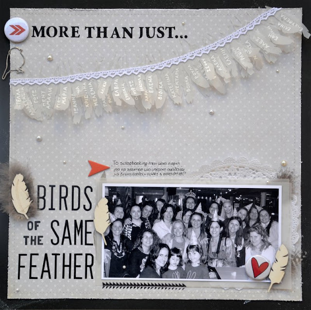
As soon as I saw the photo, I knew I wanted to do something with feathers. When I need some more inspiration about a specific word, I usually look for quotes. So I found the quote "Birds of the same feather flock together" and thought of my crafty friends that I got to know in the last three years and knew what my theme would be about:
I die cut feathers on vellum paper and wrote the names with white pen:
And combined wood veneers with feathers:
The journaling says: "Scrapbooking has been only the start for the formation of a great team and the establishment of many good friendships!"
Anna
I really love the pin photo and used lots of bits from it to inspire my layout. I use the purple, I water coloured it on the background of my layout, the sequins, the gold swirls and feathers, I made my own paper feathers! It all went well with a photo of my best hanging basket this year as it was in my favourite colours and looked great too!
Cari
I won this Psy mask on a county fair and as fast as I took this picture I knew I was going to use it for this challenge! I also got inspiration from the colors of the picture: blue, purple, brown and gold. For the tittle I wrote " Oppa Gangnam Style" The song isnt' that popular now, but I still love it.I use papers of the Atlantic collection from Studio Cálico and some letter wood venners.
Hilde
I was inspired by the feathers on the mask, and I had the colors in mind, too, when I designed this layout With a bird theme:
We have two super cute budgies at home, but who knew such tiny creatures could such an amount of feathers?In fact, I often use real feathers from the birds if I make a layout about them, but this time I din't have any on hand, so I used a large one from Bella Blvd.
Bird trim, fabric bird, journaling cards with a bird on, bird chipboards, wings chipboard - birds are all over in the scrapping industry.
Jinny
I was drawn to the feathers in the inspiration photo. So, I hunted my photo stash for any pics of birds. Honestly, I was pleasantly surprised by how many I found, but in the end, I decided to go with pics of one of my family's trips to the zoo, focusing in on the pancake breakfast we had, where all the proceeds went to help bring penguins to our zoo, as well as on my kiddos and hubby feeding the lorikeets.

And I brought in a couple of bird elements, as well as these fabulous, feather die cuts to reinforce my theme.
Katherine
I went a little bit laterally with the inspiration for this page....I started with a chevron mask and some texture paste, and then a little of the gold in the form of sequins. I tried to make my page rich in colour and texture like the masks with lots of detail and layers too.
Petra
My page is made in different layers. I started with a purple PP from FabScraps Angelic Christmas on which I placed a slightly smaller waster color paper. I placed it a bit skew and stitched it on. I then added some stencils from Crafter's workshop and a lot of different stamps I made using this month’s sponsor Teresa Collins Stampmaker fromPhotocentric.
Next I cut out two photos and some PP slightly bigger than the photos. I creased the PP in my hand and then distressed the edges with Dusty Concord distress ink before I smoothed them out again and added beneath my photos. The Chipboard is from FabScraps and I altered them first with gold ink and then with gold embossing powder before I distressed the edges with Black Sooth distress ink.
I fuzzy-cut a cage and birds from The FabScraps PP and added a purple feather. I also punched a purple stripe from the PP but I made it more like the colors of the photo using Picked Raspberry distress 

And last I mounted everything.
Rachael
The first thing that inspired me was the colors purple & blue, I thought what a great color combo... Also! was inspired by the gold glitter swirls which I added some gold glitter to the tips of the Fern Leaves chipboard!!
Stephanie
When I saw the photo of the mask, I immediately thought of a similar photograph I had taken while in Las Vegas. I knew I wanted to layout to reflect the glitz and glam of Vegas, but I didn't want to it appear too thematic. So, instead of grabbing all the Vegas-inspired papers and embellishments I have in my stash, I decided to work with more generic products.
Guest Designer - Sue
As soon as I saw the gorgeous photo inspiration for this challenge I knew exactly which photo I was going to use - Sophia dressed in her glittery dress; I love the way the sequins reflect on her cheek. I don't do glitter and bling very often and rarely scrap with purple so this prompt took me way out of my comfort zone - which is good now and again! I used a hexagon punch and outlined some of the shapes with bling. I don't think I've ever used silver foil card on a page before but it looks OK, doesn't it? I love the Studio Crafts little wooden shapes and they feature on most of my pages at the moment. I blinged them with Stickles for this page.
It amazing all the different inspiration that comes for one image, isn't it?! They are all so different!

Don't forget you can find us on Pinterest too! You will find all our DT layouts and sketches to pin!
Get creating and link up your layouts to the side bar you have until 10th November.
Stephanie
When I saw the photo of the mask, I immediately thought of a similar photograph I had taken while in Las Vegas. I knew I wanted to layout to reflect the glitz and glam of Vegas, but I didn't want to it appear too thematic. So, instead of grabbing all the Vegas-inspired papers and embellishments I have in my stash, I decided to work with more generic products.
I used a circle placemat by Jillibean Soup as a starting point and filled in the circles with patterned papers by Glitz Designs and Amy Tangerine. The gold doily on the right is from the new Maggie Holmes collection and the textured grey cardboard at the bottom is actually from an old nail polish box.
I finished things off with some feathers, enamel dots and sequins.
As soon as I saw the gorgeous photo inspiration for this challenge I knew exactly which photo I was going to use - Sophia dressed in her glittery dress; I love the way the sequins reflect on her cheek. I don't do glitter and bling very often and rarely scrap with purple so this prompt took me way out of my comfort zone - which is good now and again! I used a hexagon punch and outlined some of the shapes with bling. I don't think I've ever used silver foil card on a page before but it looks OK, doesn't it? I love the Studio Crafts little wooden shapes and they feature on most of my pages at the moment. I blinged them with Stickles for this page.
It amazing all the different inspiration that comes for one image, isn't it?! They are all so different!
This month's sponsor at The Studio Challenges is Teresa Collins Stampmaker.
Manufactured by Photocentrics whom also manufactures clear stamps.

The Stampmaker is the perfect tool if you like to design your own stamps.
One lucky winner will get one set of stamps (size A6) of their own design. You could make one single size A6 stamp or several smaller that fits in that size.
You can also order your own clear stamps at Photocentrics.
Get creating and link up your layouts to the side bar you have until 10th November.


