Sunday, 31 July 2016

31st July - Multiple Photos

Hello again, here for the 3rd challenge this month! Today's challenge is...
  
Multiple Photos; we want to see more photos on your layouts. Two, more than two or as many photos as you can fit on!

Here are the design team's layouts...

Anna
I like using multiple photos on my layouts as I think they help tell the story and also good if you have too many lovely photos to choose from! This layout was one of those times where I liked all these photos of my nephew so used them all!


Since I never use multiple photos in my layouts, this challenge was quite an interesting one. I decided to use the same photo multiple times and create a cascading effect by printing it in different sizes. To add to the challenge, I went for the masculine style rather than my usual, quite a feminine one - guess that's what happens when you have a photo of two skateboarding lads... Well, I am looking forward to  seeing your multi-photo pages.


Jinny
I kinda love multiple photo layouts!  There's just something about how two or three or even five pictures can tell so much more of a story than one.  I had such fun watercoloring a rainbow of bubbles to coordinate with all the bold, bright, happy colors in Paige Evans' Fancy Free Collection for my take.


Rachel
I love the opportunity to scrap my children in one layout and here is my take on a multi photo layout. I have used a digital cut file from Silhouette to create my circle frames. I can't wait to see all your creations x


Seungeun Lee 
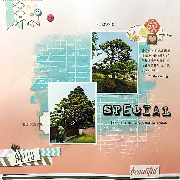
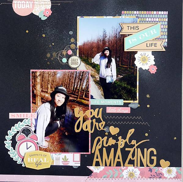
Sprinkle spray inks on paper. It air-dried then I cut two sizes of butterfly dies. I fixed bards to the middle of the overlapping butterflies.
I remember the happy look of girls who like getting heart-shaped balloons.Such lovely little girls~!


I printed my photos in a collage using Picasa and then cut them apart and placed them in a downward flow with the break in the middle that tied into the subtitle of my layout.  Multiple photos certainly make it easy to reinforce the point of the story.


I hope they have inspired you.
You have until 14th August to join in with any of the three challenges from this month. Please link them up to the side bar.

Thanks for stopping by!

Sunday, 17 July 2016

17th July - Summer

Good Morning! Today's challenge is...

Summer; we want to see your summery layouts. A nice and easy one for you today!

Here is what the design team came up with....
Anna
When I think of Summer I think of holidays by the sea, this was taken in Croatia last year, beautiful clear sea, I used ink to make the background to look like the water.


Ewelina

For me summer brings colours and fun to mind. That's why I decided to make avery colourful and sunny (can you see the sprinkles of yellow?) page. I am very curious to see you take on the theme.


Jinny
Nothing says summer, to me, more than a little free time, sunshine, and pool play.

 Lydia

It sure was fun getting out the summer colours and scrapping a summer related layout since it is currently winter here. Love the sun burst type effect I did with the paper from Crate Paper's 'Pool Side' collection. I found this layout is different for me but I love it. 


Rachel
It is winter here in Australia and summer seems a distant memory. This is a beautiful beach in Perth and here is my take on a summer themed layout. I look forward to seeing all your creations.


Susanne
Summer in July can only mean fireworks, right?  I drew a parallel between the subject of my photographs - fireworks, and the elements of my patterned paper - fireflies, to make a layout that is doubly summery.  Don't you agree?


Yasmina

I used summer colors... blue (for the beach or the swimming pool), the yellow for the sun! It is a pic of my son last january because right now it's winter for us ;)


Guest Designer Kriszti


​Summer = holiday, ice cream, sunshine
I did the background with a snow cone
I started my page for sewing. I sewed the ice cream cone and glued 3D flowers. I cut the flowers with my cameo .
I splashed ecoline paint  on the paper.


I hope that's inspired you!There happens to be three challenges this month so you have until 14th August to join in with July's challenges. Please link up your layouts to the side bar, we look forward to seeing them!

Sunday, 10 July 2016

April's winner and Favourites

Thanks to everyone who joined in with our challenges in April, here are our favourites and a winner!

A couple of favourites....

JulieJ

DSC_0001

Rainny
2016-04-10  


And our winner is.....

Cathy Lu, with this great layout made from our sketch.
0427-TSC Apr w BT.JPG
Congratulations Cathy, please email me Anna at thestudiochallenges@gmail.com to become our guest designer for a month.

See you next week for another challenge!

Sunday, 3 July 2016

3rd July - Colour Palette

Today we have a Colour Palette for you. It was picked by Susanne, I thought it was great to use today as its so close to 4th July for our American friends!

cement color

Color Palette 2630

Well...we all have colours that we prefer over others and this challenge was all about me using colours that are not my usual first choice. Finding orange and brick-red elements in my stash was close to becoming a mission-impossible kind of task but, hey...mixed media saved the day :) You can find the process video on my blog. I am looking forward to seeing your take on this colour palette.


This color palette was a challenge for me as these colors are not my favourite, but I gave it a go. I modified the palette a bit and added some pink so it meets my taste. This time I used a sketch by Ashley Horton. I created the layout with a mix of Teresa Collins Family Stories and Cocoa Vanilla Studio Free Spirit collections.


Jinny
There simply aren't enough color challenges out there anymore, y'all.  So, I just love when Anna posts one of these.  What a gorgeous palette, and it couldn't have come at any more perfect a time than to scrap pics of my cuties last 4th of July.  Nearly everything you see here came from a Hip Kit Club package at one time or another, which means a fabulous mix of goodies from manufacturers like Basic Grey, Elle's Studio, Crate Paper, and even Jen Hadfield.  To all my fellow countrymen and women in the good ole U.S. of A, have a safe and blessed 4th!

Lydia
This colour palette was very different to what I like working with, but I love how this layout turned out. All embellishments used are from the Australian flair company Studio Fourteen40, they even do international shipping if you want (just contact them beforehand).
I can't wait to see everyone's layouts and what you all create.


Rachel
Just love this mood board. I have used a collection by Photo Play which was just prefect. I have used a cut file to create my picture frames. I am looking forward to seeing what you all come up with.


Susanne 

I was struck with the challenge of combining orange with the tried and true red and navy combination.  I used nautical and tropical prints to try and tie them together on this layout about a seafood restaurant.  Luckily the orange also ties into the glow of the lights in the photo.


Yasmina 

I forgot to add the orange color!!!  My first and my last child together on this picture.  I used some papers from Canvas Corp and the grey one is an old paper from a french company (Les Papiers de Pandore). Chipboards are from SnipArt.


We have not one layout but two from our guest designer!
Guest Designer - Kriszti

I have used a digital cut file and only some elements. The cut file is very accentual. Anyway, this is my favorite photo of my niece and my daughter.  I do a lot of girly side, it is very easy for me.


The blue page is a traveling layout. The photo was taken in Croatia, Rovinj. This is a very nice place.
The layout is really blue, as the sea. I have used a variety of paper, they provide a frame for the page.


You have until 14th August to link up your layouts, so there's lots of time to join in with us!

Happy Scrapping!