Sunday, 30 March 2014

30th March - Sketch

Today's challenge is a Sketch , created by Valerie from Cari's January challenge layout.
Here are the design teams interpretions;

Anna 
I kept quite close to the sketch as I liked the layout of it. It's of my nephew all wrapped up from the cold!


Cari

How fun was to use this sketch again, I simply love it! The first time I used a cut from the cameo, but this time I fussy cut a paper. I love how relaxing it is cutting figures from different papers and the best is that you can have a lot of embellishment from it!.  


Hilde

My dog, Scoobie, isn't the brightest. She knows she's not allowed on the couch, but she thinks that if she hide her head, I can't see her.
Why the husband doesn't tell her to get off, is another story...


I replaced some of the circles with other shapes, and stamped, cut, inked and doodled the circles.


I just love the movement found in this sketch and had to add even more with my favorite splotchy use of mists.  I also pulled one of my all-time favorite color palettes into it with lots of yummy stamping and a beautiful mix of patterned papers.  In addition, this page is just the left half of a double layout.  LOVE to have you stop by my blog to see the other side!

Kat
I really liked the smattering of circles, so I played up that element, even making my photo a circular shape...

I loved this sketch, it gave me loads of creative space, and I used stencils and inks to create an EGO-page about myself.


I loved the sketch. So easy to get inspired from.
I used a lot of mediums on my page and many many layers.


The picture is one of my daughter just awoke in the morning... often not a sunshine girl at that time of day LOL. 

I used Maggie Holmes Flea market from Crate Paper when I created this page. 


Stephanie

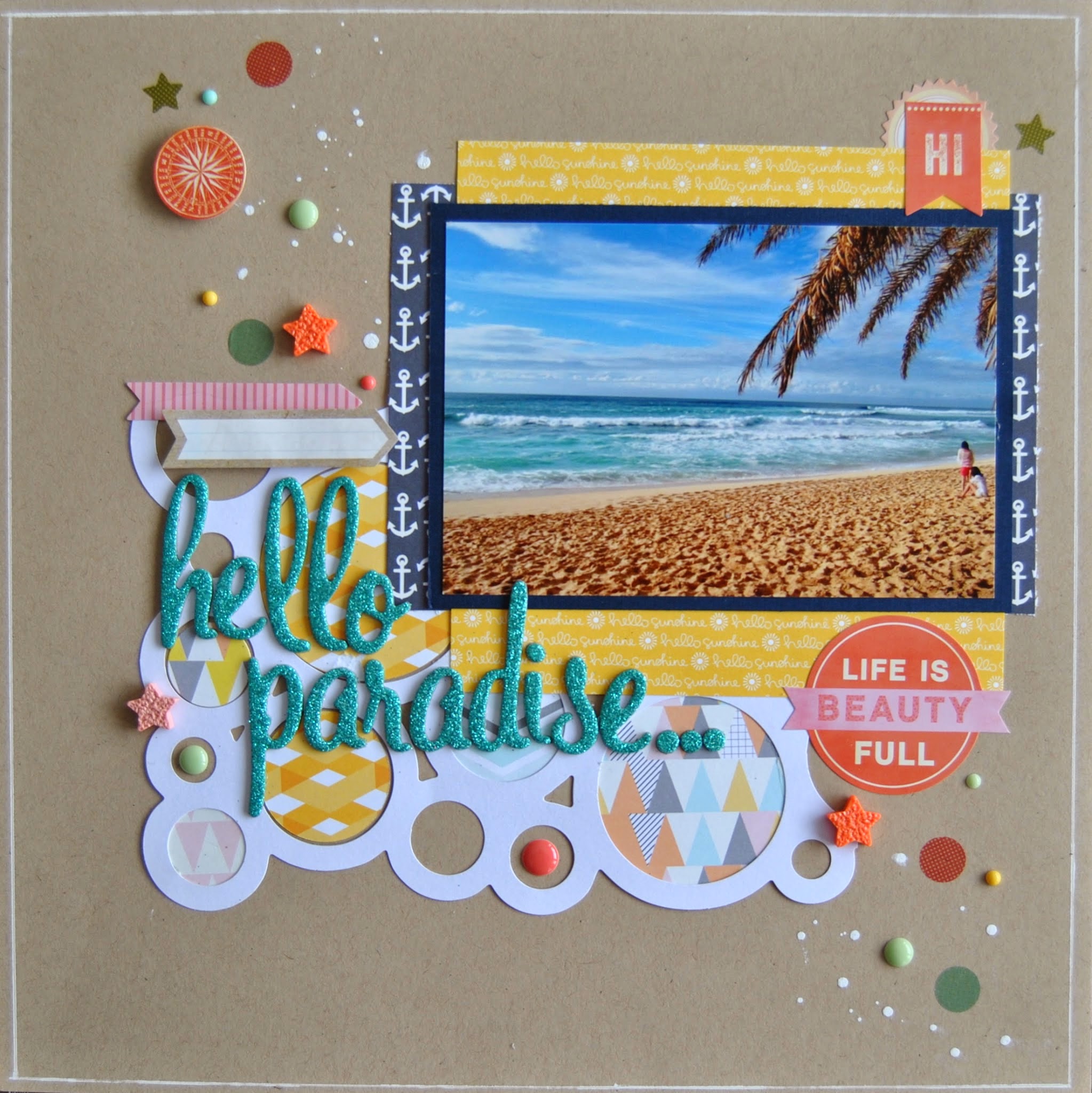
I was so excited to work with this sketch because I love incorporating circles onto my layouts! For this particular layout, I ended up using a circle placemat by Jillibean Soup and several small, round embellishments like enamel dots and ink drops. My layout ended up being a loose interpretation of the sketch, but that's what is so great about sketches ... you can use them just as a base for inspiration!


Hope that's inspired you to get creating!
Please link up your layouts by 13th April to be in with a chance of being our guest designer!

Sunday, 23 March 2014

February's Favourites and Winner

We had some lovely entries to our February Challenges and here are some runners up first:

Rita

Kerry

Lesley G

And the winner is:


M Letizia


Congrats!!!

Please send an e-mail to thestudiochallenges@gmail.com and you will receive your prize from Februarys sponsor:


Thanks to everyone who entered.

Sunday, 16 March 2014

16th March - M

Time for another challenge, you're lucky this month as there are not 2 but 3 challenges in March!

Todays challenge is M for March - make a layout using the letter M! It could be the title or anything being with M!

Here are the design teams M's!

Anna
My M is for Mouse, the little visitor we had to our garden in the autumn. He didn't mind me getting quite close to him to get a good picture!


Cari


I'm getting married next month and since the proposal I haven't done any layout about that ocassion, so this M challenge was the perfect excuse!


Hilde

This is my son M. He's fourteen. As a toddler he was the Early Morning Bird, but that has changed. If he was allowed to, he would probably sleep all day long (sounds familiar?)


Details: painted wooden numbers, duct tape sticker, paint, stamping etc. I think the clocks on one of the patterned  emphasized my theme perfectly!

Supply list on my blog :-)


Jinny
What a fun challenge!  As soon as I saw it, I knew that I wanted to use it to support pictures of yummy food; and these cute pics of my baby girl, helping to decorate Valentine cookies, just happened to be lying on my desk.  So, they quickly became the subject of my page, which boasts elements from a happy mix of manufacturers and lots of watercolor and stamping.


Kat
My "M" is for "Molly Grace," my seriously cute niece.


Katarina

My take on this is an EGO-page. The title is from an old song by De La Soul, my kids had such a laughter when we browsed  YouTube, and I told them that lots of kids actually looked like that when I was a kid when we looked at Me, myself and I... 
the title got stuck and "mirror mirror on the wall"  it ended up as a ME myself and I, LO *lol*


Petra
My M page is all about My 3 sweet-hearts, i.e. my kids. They brighten up my life <3


I have used Crate paper Maggie Holmes Styleboard collection for this page with a stencil from DreamWeaver, modeling paste with LuminArte pigments and AC Thickers.

Stephanie
When I heard the challenge, I began thinking about possible titles beginning with the letter "M" ... the first one that came to mind was "mmm" (as in delicious) and I knew this photo of a guava passionfruit cupcake I had in Hawaii last month would be perfect. It really was delicious! 


You have until 13th April to join in with this month challenges for a chance of being our guest designer.

Hope you like our new look, its nice to have a fresh change around here. We now have a DT page too so you can find out a bit more about us!

Happy Scrapping! :-) 

Sunday, 2 March 2014

2nd March- Scrap Lift

Today challenge is to Scrap lift yourself - take a layout that you loved that's at least a year old and scrap lift yourself!
Please include both your layouts!

Here's the design teams lifts; sadly Katherine has now left the team and we welcome Katarina!

Anna:
I found it quite hard to pick one of my layouts to scrap lift, as I like all my layouts to be different but in the end I settled on this layout from 2011 as I really liked it. I made sure my new layout was different with the colours I used. 

Cari:
For this challenge I decided to re-do a Lo I made back in 2011 when I was starting into scrapbook, I didn't hace many supplies and neither the skill of taking good photos, anyway is a Lo I like a lot, and I love sunburst!
This time I use a photo of my family and change the side of the sunburst, and the colors, I love the new result!


Hilde:
I usually scrap with 7,5 * 10 cam photos, but I had this photo I wanted to be larger, 10*15 cm. So I browsed my 2012 layouts to see if I could find a design suited for a larger photo. I picked this layout made in September 2012:
Here is my new layout, featuring my youngest kid (laying in the snow) and his BF laughing about his big failure when attempting to do a trick with his snow toy:
For details/close up photos, please visit my blog (see right hand bar)


Jinny:
This was a super tough challenge for me, as my style has changed so much over the years.  But I dug into my summer 2011 files and came up with this fun page to lift.
I haven't used that leafy stamp in ages, so I couldn't resist bringing it back for this take boasting lots of new goodies from Elle's Studio and a darling, vintage, Valentine image from JBS Mercantile.  And instead of chipboard numbers for my hubby's age, I used the same idea to model the year.


Kat:
I dug way back into my scrap archives and picked one of my favorites...it's a layout from 2010.  Here is the original:

Here is my new take on it:
I kept to the rainbow theme, the black and white photos and the black lettering.  And now with all this color I think I'm ready for Springtime!

Katarina
I love to scrap using lots of mists, inks and embellishments. For this challenge  I chose this LO that I did 2010.  
and this is my scrap lift
My personal style is there... but I narrowed down the white space even more changed the color palette but kept the clusters and the romantic touch.. and I added stencil patterns that is a bit more visible than on the original LO.

Petra:
I choose this page all the way back from 2011 to LIFT and it was not easy because I still like this page and I wanted the LIFT to stand up to it.

And this is what my new page looks like:

I added some aquarelle colors on the background, some stitching and tilted the design. But I kept the overall design and the elements like 3 smaller photos, flowers and bling swirls. I used the Beachcomber collection from FabScraps.

What a great job everyone did! Hope that inspires you to get vlufting if so we would love to see your creations! Please link them up to the side bar for a chance of being our guest designer for a month.
Happy scrap lifting!