Today we have another lovely sketch for you! Valerie was inspired this month by Jinny's Christmas tag layout.
Hilde
The first weekend in January, I took the family, and two of the kids' friends, up in the snowy mountains here in Norway. We have had a grey, wet winter so far where we live, so we had a blast with all the snow.
And of course the kids had to try snow bathing one of the nights (Me? No! I'm done with that).
Details (papers: Lemon Owl, buttons &snow flake brads: Freckled fawn):
Usually when I scrap snow photos I go for bright colors, but I love how this color scheme emphasize the night photos!
Jinny
I was so excited to see the sketch Valerie put together from my original, Christmas Snackin' layout! There's something about a trio of photos that really helps tell a story, and this is my go-to design for just such. But since you've already seen what I can do with it just as it is, I decided to rotate the sketch and use vertical, rather than horizontal, photos for this month's take. Plus, I simply didn't get enough of my fall pics turned into pages last year and had lots of little, Basic Grey, Persimmon Collection, die-cut bits just calling my name.
Kat
I loved Jinny's original layout and had such a fun time adopting Valerie's sketch to my own style.
Katherine
A lovely sketch with loads of layers and photos - I rotated it and piled up layers of paper, and embellishments from a mixture of different collections.
Petra
I do not often use more than one photo on my pages but I do like the result.
The page is from our 3 week long trip to Thailand this Christmas. Loved every day of boat trips, snorkling, swimming, massage and just relaxing reading lots of books. It feels very different from today when we have snow outside in a cold Malmö.
On this page I used FabScraps new collection Beachcomber debuting at CHA last week.
Stephanie
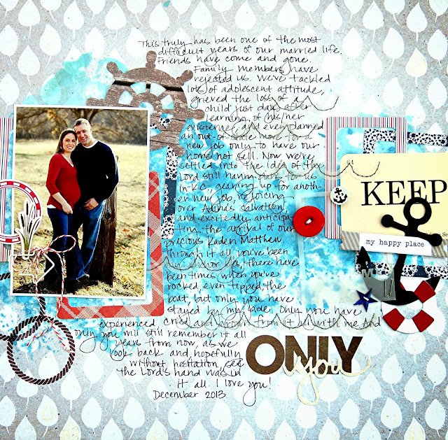
When I first began pulling together supplies to use on this layout, I printed 3 photos of my husband and I from a photo shoot we did two years ago. However, once I started playing around with the layout I realized that I liked the design best with just one photo in the middle. So I altered the design slightly to accommodate one 4x6 photo instead of the original 3 smaller photos.
Our sponsor this month is Wear Crafts:
Facebook page https://www.facebook.com/pages/Wear-Crafts/
It would be lovely if you would pop over and follow the
shop blog http://www.wearcrafts.co.uk/blog/
If you join in with us this month you could win this great kit of Basic Grey Hipster papers! It has 13 papers and alphas to match!
Please link up your entries to the side bar for a chance to win. You have until 2nd February to enter this month challenges.


