Sunday, 26 October 2014

26 October - Mixed Media

Today's challenge is a fun one....we want you to GET MESSY!  Create a mixed media inspired layout!

For those of you that may need a little help, here's the definition of Mixed media:
A technique involving the use of two or more artistic media, such as ink and pastel or painting and collage, that are combined in a single composition.

Here are the fabulous creations that the design team made:

I love playing around with mixed media and my paints, mists stamps and stencils so have a great time on the layout!

Hee Sun Kim
I'm getting on the old bicycle. AND...Now my journey has begun....


Hilde
Isn't this dude the cutest?
We were out for dinner, and when we came back to our stateroom on the cruise ship (yepp, cruising in September) he just was there :-)
Details/close up photos in my blog.

I pulled in lots of messy goodies for my take from mists and inks to acrylic paint and a bit of Color Shine, not to mention a heap of stuff from October Afternoon's new Apple Cider collection.  I was thoroughly inspired by all the wonderful goodies I received in this month's Jenni Bowlin Papercrafting Kit.  It simply oozes my favorite time of year.

Kat
I pulled out a bunch of messy stuff to make my background for this layout...

 I loved this challenge! Almost all my layouts have paint on them, so it was right up my alley. I took this photo of our yard a few weeks ago and it inspired me to use some fall colors.

Tessa
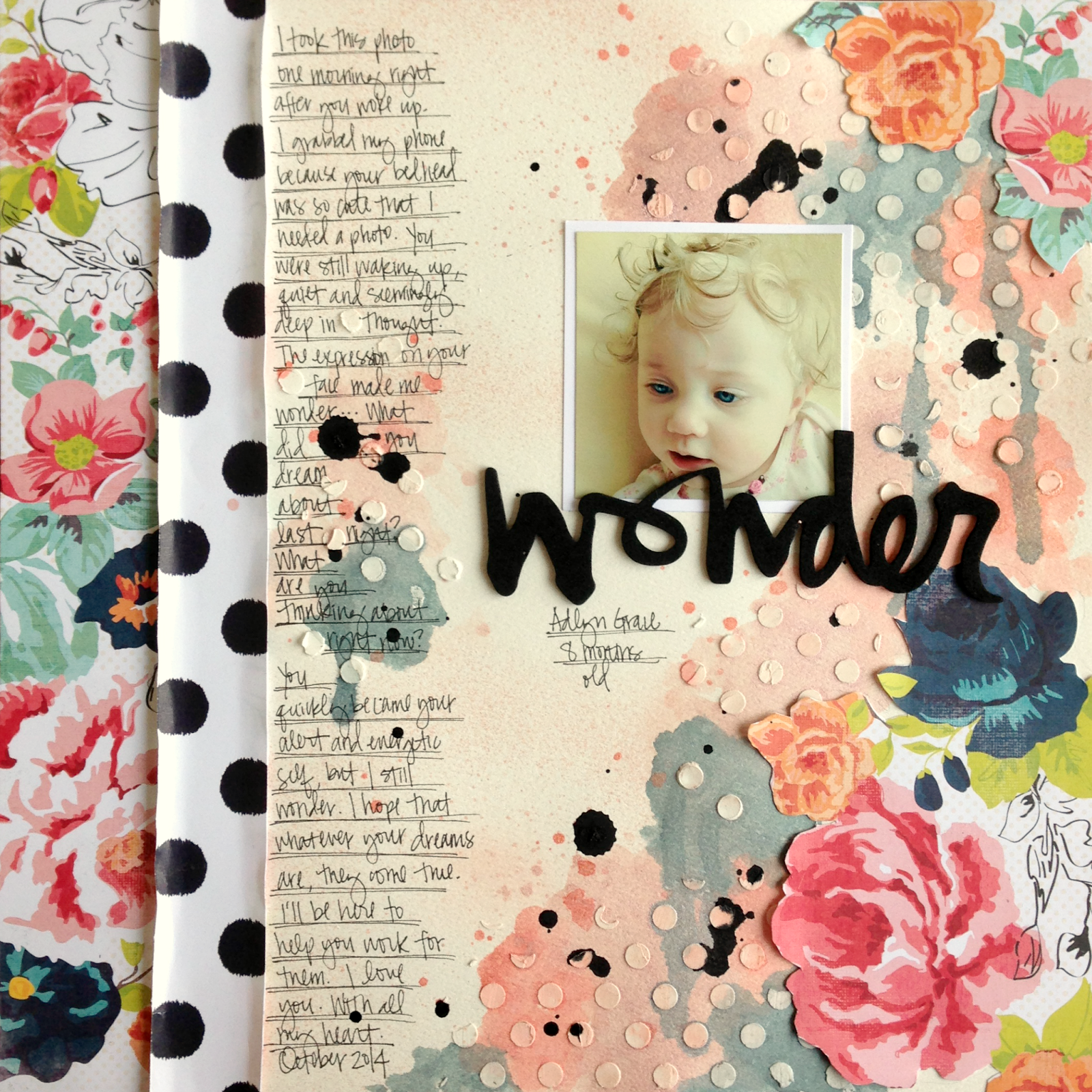
It was good for my crafty soul to stretch outside my comfort zone for this challenge! I used whipped spackle and a stencil, india ink and Heidi Swapp mists on watercolor paper to create my background.

Once again, the design team did an awesome job!  We hope that we've inspired you to get out your mixed media products and get messy with us.  Remember to link your projects up in the sidebar for a chance to win this month!

Sunday, 19 October 2014

September Winner and Favourites

Browsing through all the entries for September was so much fun – we just love how different everybody is solving the challenges.
Picking winners is always hard. Every creation has something special in it, and they often give us glimps of your everyday life – they are personal to each and every of you.

But it has to be done and here are the winner and runners ups:

Our winnner is......


We love Erina's take on the sketch and those great circles!

Runners up, in no particular order:
Yvonne

Kerry

Lesley
Congrats ladies!

Erina, please email us at thestudiochalleges@gmail.com so we can discuss the details about a GDT spot 

Sunday, 12 October 2014

12th October - Big Photo

Today we want you to create a layout that focuses on the photo. Please use a photo that is bigger than standard 4" x 6" size on your layout, how big can you go?!

Anastasia

For this layout the first decision was, of course, the photo. I thought "which is the first photo that comes to my mind that I really love but I haven't used in a layout yet?". And Lola's photo as a less two months old kitten came to my mind:


HeeSun Kim

A few days ago, I went to a park called "Sky Park". There is only filled with flame grass. I've got peace of mind there. And, I felt the love. I have print large photo of 12 x 12. I think it was a very good choice.


Hilde

These guys are my two sons during a session with two professional photographers at a cruise earlier this fall. When I picked this photo as one of my favs, the photographers though I was crazy - was this something to keep? I knew it would be perfect for telling the story about the session and I love how this layout came out.
I do apologize for the slighty angled image - I need to practise on taking good shots of my layouts :-)


Jinny
I hope that I didn't totally cheat this one.  While I'm more of a small photo scrapper, I really would've loved to do this one justice with a big photo; but with my busy schedule, I just didn't have time to sort through my thousands of photos to pick one that deserved the larger size and have it printed in time.  I did want to get this 5-3/4" x 8" birth announcement for my littlest into his book, though.  So, I went with it, using the palette from the announcement itself as inspiration and pulling in a few of my favorite patterns (i.e. gingham, polka dots, and bitty florals).


Kat
I had a really hard time with this challenge.  I will admit that large photos make me uncomfortable.  I've had this family photo laying around for a while.  I am not too happy with the end result - I guess that means I just need to keep practicing!  :-)

Leslie:

Long ago as a project had scrapear This photo is not wanted me to another job decorating my house, until finally win out and can translate a simple and details idea. A worn photograph with the time it deserves be collected and treasured.


Sindi
This was sooooo hard for me! I am accustomed to using smaller photos for some reason. I'm glad I stuck with it, though. I am tickled pink with the end result. This photo of my little boy deserved to be big anyway. :)  

Tessa
I loved this challenge! I had my photo printed as an 11x14, then I trimmed it down to 11x12 and filled the additional space with tags and die-cuts. Can you believe this started as an iPhone photo?


The design team did a great job again! So now its your turn, what an you do with a big photo? You have until 9th November to enter.
Happy Scrapping!

Thursday, 2 October 2014

Special Feature

Just had to pop in and show you this gorgeous layout that Kerry Bruce made. It was Kerry's original layout that she created for our Button challenge as our guest designer that our September sketch was taken from. Here's the original:
 
And this is the layout Kerry made from the sketch.
Its amazing to see how different she has made her second layout, what a great job she did!
Many thanks to Kerry!

You still have until 12th October to enter Septembers challenges so get creating, we would love to see!