Catching up on September's challenge winner and favourites, without further ado...
Our winner is...
Sue which is gorgeous layout.
Congratulations Sue, please email me (Anna) at thestudiochallenges @gmail.com to become our guest designer for a month.
Our favourites are...
Wendy
Jenny
Heidi
Lovely layouts ladies!
Thanks for everyone who joined in with for September, we love see how our challenges inspire you!
Do you fancy being on our team? If so there will be a design team call coming soon! Watch this space!
Sunday, 27 December 2015
Sunday, 20 December 2015
20th December - Gifts and Giving
Our last challenge of the year is...
Gifts and Giving - as Christmas is so close now today's challenge is about the words gifts and giving, anyway to want to use them.
My youngest daughter is a panda-holic so one year I bought her the perfect gift - a giant plush panda. It's always satisfying finding a gift that you know will be loved and bring such joy to your child.
One Saturday before Christmas, my family and I had the opportunity to help make 141,000 meal packages through a hunger relief organization known as Numana. This was hands-down the most memorable gift I got to give that Christmas. I added lots of little packages, even a stamped/watercolored truck filled with gifts, to connect with the theme.
We would love to see what gifts or giving you have been giving or receiveing, please link up your layouts to the side bar, you have until the morning of 3rd Jan to join in.
I would like to wish everyone a very Happy Christmas, I hope you have a great time full and family and fun! Thank you to everyone who joined in with us this year.
We will be back on the 3rd January 2016!!
Sunday, 13 December 2015
August Winner and Favourites
Sorry for the delay on choosing winner and favourites, I must try harder!
They were so many gorgeous layouts we had a hard time choosing these! Thank you to each one of you that joined in for August, you all deserve to feature here!
I will start will the winner this time.
The winner is.....
Jade with this pretty layout
Congratulations Jade please email me (Anna) thestudiochallenges @gmail.com to be our guest designer for a month.
Some of our favourites are....
Melenia
Sandy
Mary
Hope you enjoyed seeing them, see you next Sunday!
Labels:
Winners
Sunday, 6 December 2015
6th Dec - Sketch
It's time for another sketch here at The Studio today! I created this Sketch based on Jinny's previous layout for July's handmade embellishment layout. Hope you like it!
Here are the design team's takes on the sketch....
I absolutely loved working with this sketch as it has layering, white space and plenty of embellishing! My background is a sheet of vellum with gold glittery stars, the perfect backdrop for my photo and I even have a layer of patterned paper under it!
I just love the possibilities this sketch provides! I mirrored it for my take of my daughter's first papercraft publication and, once again, couldn't help but dive into my November Hip Kit Club goodies.
Hope thats given you inspiration on how to use this sketch, we would love to see what you make with it please link them up to the side bar.
Happy Scrapping!
Sunday, 22 November 2015
22nd November - Pinterest
Todays challenge is a...
Pinterest challenge. Kerry has picked this pin to inspire us.
Photo credit - Apartment Therapy
Here are the design teams layouts...
Kerry.
The elements that I took from the image for inspiration were the frame, triangles and wood. I also used the word 'Happy' that you can see in the mirror as part of my title. What will you take from the picture to inspire your layout?
Kerry.
The elements that I took from the image for inspiration were the frame, triangles and wood. I also used the word 'Happy' that you can see in the mirror as part of my title. What will you take from the picture to inspire your layout?
Jinny
I was drawn to the triangle and woodgrain elements and knew that I wanted to tie in a little bit of gray as inspired by that yummy floor. The mirror itself influenced my bits of shimmer and shine. I also loved the mix of metals and, of course, the word "HAPPY". The nature-inspired color palette so badly wanted to become a part of my page, but I had a super, fabulous, Hip Kit Club package lying on my desk, screaming for some attention. It, obviously, won the battle.
Lovely layouts! How does the pin inspire you? Please link up your enteries to the side bar, we would love to see them!
Happy Scrapping!
Sunday, 8 November 2015
8th November - Autumn/Fall
Todays challenge is nice and easy, it's about...
Autumn/Fall - the colours here is the UK have been wonderful this year so I want to see your layouts about autumn/fall. Any way, any how!
Here are the design team's take on the challenge:
Elisabetta
these patterns are perfect for fall/autumn: flowers, leaves, cold colors! I love them!!
Jinny
This one was a no-brainer for me, as every fall, my family takes a trip to the apple orchard to pick apples for the purpose of turning them into homemade apple butter gifts for the holidays. The photos below were of my littlest's first trip with us. He just sat in the shade and soaked up all the activity.
Kat
I pulled in some fall colored patterned paper to scrap a quick layout about how my dog loves his fall walks.
Kerry
One year my girls primary school employed a photographic company with a difference. These beautiful owls guaranteed to put smiles on the children's faces! The photo background is a perfect starting point for this challenge.
Seungeun Lee
These days, the color of the leaves are beautiful too. This only seems natural that can produce colors.
You have until 6th December to join in with us.
Happy Scrapping!
Sunday, 25 October 2015
25th Oct - Tic Tac Toe
Sorry I'm a bit late posting today, better late than never though!
Today challenge is....
Tic Tac Toe - You can pick any line going down, across or diagonal, once you've choosen create a layout with those three things in. The design team each picked one thing to go in the grid.
Today challenge is....
Tic Tac Toe - You can pick any line going down, across or diagonal, once you've choosen create a layout with those three things in. The design team each picked one thing to go in the grid.
Here are the design team's takes on it....
I decided to go with TAG-WHITE BACKGROUND-GOLD. seriously this was so fun!! I looooved this challenge :)
I know it only takes three in a row to fulfill the challenge, but I guess I was going for a blackout; because I found inspiration in almost every element of the board, withholding only a white background.
For this super fun challenge, I decided to go with the gold-sequins-mint combo. It's a bit hard to tell from the picture, but my sequins are gold. :)
Who doesn't love a Tic Tac Toe challenge? For my layout I picked stitching, blossom and gold. What will you pick?
I decided to go with the Paint-Blossom-Sequins~!!You are enjoying this autumn?!
I had a good time and enjoy the cosmos with thatched festival with friend.
Enjoyed creates a ring of flowers. You fully enjoy before the end of this autumn.
Tessa
I couldn't make up my mind which row to do, so I did a little bit of everything!
Vasso
I love this combination with gold, mint and sequins! I love this paper with the sequins on it and the gold elements of the " I am" collection!
Gorgeous layouts from the design team!
You have until 8th November to join in with us, we would love to see which line you take for your layout!
Sunday, 11 October 2015
11th October - Sketch
It's time for another sketch! I created this sketch with inspiration taken from Kat's Stars and Stripes challenge layout.
Here are the design teams takes on it ...
Jinny
Kat
I usually have a very difficult time scraplifting myself, but this challenge was easy for me. I think we all have those "go-to" designs when we are slightly stuck that help to jumpstart our creativity. This is one of those designs for me. So, it was easy for me to change it up just enough to create an entirely different look, but it came together so quickly - probably in less than 30 minutes!
Kerry
I was looking through my older photo's looking for two suitable ones for this sketch when I came across this sweet photo of my youngest DD and as it was landscape I thought it could replace the two portrait ones in the sketch.
I used Pink Paisliee's Cedar Avenue collection.
Seungeun Lee
First attempted curly hair~!But my nephew did not like...
Vasso
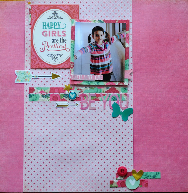
I love this sketch! I decided to use one photo and this beautiful quote that I really believe! Happy Girls are the prettiest!
Guest Designer - Rainny
We got married in 2015 and this layout is to record the moment when we exchange our rings.
I want to share my happiness with you.
Hope you have fun wih the sketch. You have until 8th November to join in with us.
Happy Scrapping!
Sunday, 27 September 2015
27th Sept -Scrap Lifts
Today's challenge is....
Scrap lifts - The design team have each picked layout that another design team member had created for a previous challenge and scrap lifted it. Now we would you to scraplift our scraplifts!! We tried this challenge last year and it seemed to go down well so we are giving it another go!
The design team have posted the layouts they have scraplifted along with their scraplifts...
Elisabetta
This is Kat's layout. I loved the design, the colors and all the white space.
and this is my layout! I used my Clique Kits October kit to create this layout. the picture was taken while I was on vacation with my friends in the south of Italy :)
HeeSun Kim
Jinny
I am naturally drawn to layouts with multiple photos and liked that aspect of Anna's take on our Food Challenge. However, I don't normally use plain white cardstock as a base for my pages and was inspired by her use of such here, as well as the amount of white space she utilized.
I also, once again, combined goodies from a couple of different Hip Kit Club packages and had fun creating a custom foundation for my photos with mists and inks.
Kat
For this challenge, I chose to lift this awesome layout by Jinny:
I loved all the fun layering beneath the photos and the sprinkling of embellishments down the page. Here is my take:
Kerry
Looking back through the DT layouts I found this layout by Vasso from April 2015 to scraplift.
Tessa
I loved the painty stripes on this layout by Elisabetta from this past May:
The challenge was to use pink, gold and black. Since I didn't get a chance to play along that week, I decided to lift her design and the color palette.
Vasso
I love this page that Kat made for the spring challenge!
and this is mine
I think the design team have really rocked this challenge, great job ladies!
Hope that's inspires you to join in with us, you have until 11th October to join in, we look forward to seeing which layout you pick to scraplift.
Scrap lifts - The design team have each picked layout that another design team member had created for a previous challenge and scrap lifted it. Now we would you to scraplift our scraplifts!! We tried this challenge last year and it seemed to go down well so we are giving it another go!
The design team have posted the layouts they have scraplifted along with their scraplifts...
Elisabetta
This is Kat's layout. I loved the design, the colors and all the white space.
and this is my layout! I used my Clique Kits October kit to create this layout. the picture was taken while I was on vacation with my friends in the south of Italy :)
HeeSun Kim
This is Elisabetta's LO. Simple and beautiful layout! I went to Osaka in July. When I arrived, The festival was held in Osaka. Light the streets for a festival...It was a very beautiful sight.
Jinny
I am naturally drawn to layouts with multiple photos and liked that aspect of Anna's take on our Food Challenge. However, I don't normally use plain white cardstock as a base for my pages and was inspired by her use of such here, as well as the amount of white space she utilized.
I also, once again, combined goodies from a couple of different Hip Kit Club packages and had fun creating a custom foundation for my photos with mists and inks.
Kat
For this challenge, I chose to lift this awesome layout by Jinny:
I loved all the fun layering beneath the photos and the sprinkling of embellishments down the page. Here is my take:
Kerry
Looking back through the DT layouts I found this layout by Vasso from April 2015 to scraplift.
I loved the split page and the dramatic paper on the left.
For my take on Vasso's page I used gorgeous Heidi Swapp papers.
Tessa
I loved the painty stripes on this layout by Elisabetta from this past May:
The challenge was to use pink, gold and black. Since I didn't get a chance to play along that week, I decided to lift her design and the color palette.
Vasso
I love this page that Kat made for the spring challenge!
and this is mine
Hope that's inspires you to join in with us, you have until 11th October to join in, we look forward to seeing which layout you pick to scraplift.
Subscribe to:
Posts (Atom)